

From Cluttered to Clear: How to improve your PowerPoint slides

By Paul Moss
Join 100k+ subscribers on our YouTube channel and enjoy highly engaging lessons packed full of best practices.
Your main goal should always be to make your slide as readable and easy to understand as possible..
Back in 2014 activist Hedge Fund Starboard Value made a successful bid to oust the board at Darden Restaurants, a company that owns multiple restaurant chains in the US including a beloved Italian restaurant called Olive Garden.
In this post, I’m going to take one of the slides from this presentation and show you exactly how to take boring unprofessional slides, and turn them into slides that are clear, insightful, and engaging. I’ll walk through each step of the redesign explaining the logic behind each choice and why it matters for your audience. Plus I’ll provide you with some great PowerPoint tips along the way to help you build your slides a whole lot faster.

FREE Slide Design Course
Enroll in our free 5-day email course and learn how to design slides like a McKinsey consultant.
Complete hands-on exercises , review a realistic consulting case study , and get personalized feedback from your instructor!
Plus get a free copy of our Top 50 PowerPoint Shortcuts for Consultants cheat sheet.
Learn More ➔
Success! Please check your email.
We respect your privacy. Unsubscribe anytime.

“Transforming Darden Restaurants” Starboard Value, September 2014
As you can tell the slide is all about breadsticks, and how Olive Garden’s lack of training and discipline is leading to reduced profitability and a poorer guest experience.
The first thing that strikes me about this slide is just how much text there is. That’s not inherently bad — a common feature of slides in consulting, strategy, or finance is that they contain a lot of information that needs to be digested by the audience all at once.
What’s difficult about these types of slides is that they can overwhelm the audience. Especially if it’s delivered live where the audience has to read all the information on the slide, listen to the speaker, and potentially think of a response. Even for a smart person, it’s a lot to ask. So your job as slide creator is to make it as easy as possible for the audience to understand your message by limiting distractions, drawing attention to the important parts of the slide, and guiding your audience visually.
When you look at this slide, which parts of the slide are distracting, and are they important to the slide’s message? For me, it was the dark blue boxes: the one down at the bottom with the slide’s main message, but then also the blue labels for the table. The box at the bottom says, “Olive Garden is famous for its unlimited breadsticks, but poor execution around this signature item we believe both increased costs and hurt the guest experience.” To me, this is a pretty important takeaway from the slide, so I’ll leave it in place for now.

But then how about the other blue boxes? Do they need to stick out so much? I need them to support the information in the table, but I don’t think they should command so much attention.
So the first thing I’m going to do is remove the attention-grabbing blue color. I’ll do that by holding the control key as I select all the objects (or CMD key if you’re using a Mac), then using my ribbon shortcuts to change the shape fill and the font.
I’ll hit Alt to access the commands in the ribbon, then H for home, then SF for shape fill, and then N for no fill. And then obviously the text can’t be white so I’ll follow the same process to get to the Home tab, then hit FC for font color, and choose the blue color.
Another thing on this slide that I think is unnecessarily distracting is the picture of breadsticks down at the bottom. The rule with pictures on a slide is you want to make sure it’s contributing to the message in some way, and not just there for good looks.
This one could probably go either way because, on the one hand, I think it’s good to be able to visualize the topic, but on the other hand, we all know what a breadstick looks like and this isn’t providing any new information. Not to mention, I don’t think it fits in cleanly on the slide – it just sort of sits down at the bottom and isn’t aligned with anything. So I’m just going to delete it.
Now on to the background. The general rule for backgrounds is if you notice it, you need to change it. And this one I noticed right away. Maybe it’s just me but it’s incredibly distracting and almost looks a little unprofessional, especially when the text is also blue.
So to delete this unsightly background I’m just going to right-click on the slide and go to format background, select solid fill, then choose white.
Now I know what you might be thinking here, this slide is starting to look a little plain. But remember, the first step here is to remove distractions that aren’t important to the slide’s message, so that’s what we’ve done. Now, we’re going to put more emphasis on the important parts. And this is where it starts to get a little more interesting.
Generally speaking, the most important part of any slide is the title. People like to look there first, so you want to make sure your title attracts attention and provides valuable information. On this slide, however, the blue box down at the bottom is a little more attention-grabbing, so the path for the audience isn’t quite as clear. Should they look at the title first? Or the box? Or maybe the subtitle? We want to remove that complexity and make it as easy as possible for the audience to know where to look first, then second, then third.

The title of the slide says, “Breadsticks: just one example of food waste”, which is short but provides a good idea of what the slide is all about. Then there’s this subtitle, “As just one example, we believe lapsed discipline around Darden’s renowned unlimited salad and breadsticks offering has led to both high food waste and a worse experience”.
You might have noticed that this sounds very similar to what is already in the box down at the bottom, and I don’t think we need both. Of the two I like the bottom one better so I’m going to select the text by hitting control A, the control C for copy, and go up to the top and right-click and go to paste, then over to the option that says paste as text. That way I don’t have to worry about formatting.
I mentioned earlier that you want to guide your audience visually, and part of this includes directing their attention to the highest level ideas first, and then to the details. The idea behind this is the Pyramid Principle, which we’ve explained in more detail here , but basically, it’s a method of communication that involves starting with your main point, then working your way through the supporting details of that main point. The advantage of this approach is that it helps you communicate a lot of information in a way that’s easy to understand and digest.
The way we do that on a slide is by making sure the title captures the slide’s primary takeaway, and that it’s the most attention-grabbing part of the slide so the audience looks there first.
Take a look at the BCG slide below for example. Notice how the title sticks out from the rest of the slide. It’s bold, it’s got a large font, and it has a dark green line underneath it. By reading the title first the audience will understand the main takeaway for the slide, so when they get to the details in the chart and in the bullet points, they’ll have some guidance and some context.

To maximize the clarity of our Olive Garden slide I’m going to do the same thing – put the main idea at the top, and then the supporting points beneath it. It looks like they’ve kind of done that already by putting a short title on the top, then a more detailed subtitle just below it. This is something I see quite a bit, and I think it accomplishes the goal of providing a summary of the slide.
But the issue is the subtitle is really where the main takeaway is, and it doesn’t grab that much attention. So what I’m going to do instead is move that text to the title, and just delete the subtitle. Then I’ll just cut out some words from the title so it fits and drag some of the other objects up to get rid of some white space. Now we have a nice clear title that summarizes the slide really well.
Alright now that we’ve got the main message of the slide clearly in place, we can worry about the rest of the content on the slide (and this is where things can get tricky). There’s a lot of text on the slide so we need to find a way to naturally separate the different sections so they’re easy to distinguish visually.
The first thing I’m going to do is to separate out the takeaways down at the bottom. They’re obviously very important in helping to show the difference between 10 years ago and today, so I want to make sure they don’t blend in too much with the rest of the text. The easiest way to do this is by holding the control key and selecting each of the boxes, dragging the bottom part of the box up, and then I’m just going to duplicate them by holding down the control and shift keys and dragging them in a straight line downwards.
Then I’ll just change the text to say what I want, and increase the font by hitting Control Shift and the greater than sign, then bolding it by hitting Control B. Then I can get rid of the extra text and move the icons to the side for later use.

By the way, if advanced keyboard shortcuts like this are new to you, or if your PowerPoint skills could use an upgrade, make sure you check some of our other resources on PowerPoint. We’ve got some great posts here on our blog, a very popular (and free) PowerPoint shortcuts cheat sheet , and full courses that provide advanced PowerPoint training for consulting, strategy, and finance professionals.
Now on to the text. Notice how right now the text is all the same color and at first glance it sort of blends together. So to make it a little easier to process I’m going to first change the main text to black. I’m also going to make sure the bullet points are black as well, and I can change these things pretty quickly just by using my ribbon shortcuts.

Another thing I’m going to do is separate the subtitles/labels a little better by increasing the text size and adding lines underneath the top two. A neat trick to know here is when you’re adding a new line, hold the shift key and the line will be perfectly straight every single time.
Then I’ll make it black, and copy it over using the same shortcuts from earlier. Then just for good measure I’ll delete the extra line and increase the font size of the main text, just to make things a little more readable.
The takeaways down at the bottom feel separated from the main text but I think we can do a bit better. First of all, I want to align them better and I can do that by selecting each of the text boxes and going up to the align text menu in the ribbon, and selecting middle.
I’m also going to try and use the icons because I think they do a good job of providing a visual cue for which approach is better. So first I’ll adjust the margins of the text box and move the text over, and I can do that by again using the ribbon shortcut to get into the format shape menu, and changing the left margin. Then I’ll just drag the icons over and make them a little bigger. Then I think we can take it just one step further by putting a shaded box behind the text to make it pop just a tiny bit more.
Another critical part of formatting is you want to continue to draw attention to what matters. We’ve already done that with the title at the top, and the key takeaways down at the bottom, but you can also bold the keywords on the slide to make skimming the content just a little bit easier. Not everyone likes to do this, but I think it adds a nice touch.
So I’m just going to read through the text and bold what I think is most important. It’s going to be hard to notice much of a difference because we’ve already been looking at this slide for so long, but for someone looking at this slide for the very first time, bolding keywords like this can make a big difference.
Then just a few more finishing touches to help with the spacing on the slide and the overall look and feel.
So as we compare the slide with the original, you can see that it looks quite a bit different. The slide might not be the best-looking slide out there, but anyone who looks at this slide is going to have a significantly easier time processing the details and understanding the main takeaway.

Ultimately, your main goal isn’t to make the slide as “pretty” as possible. Your main goal is to make your slide as readable and easy to understand as possible. We didn’t really change any of the content on the slide or remove any of the information, but we did reformat it in a way that’s more natural for a first-time viewer.
You can watch a video version of this article on YouTube .
- Print Friendly
Working with whitespace: Presentation design tips
- Written by: Archie McLachlan
- Categories: PowerPoint design , Visual communication

Space: Vast – Unknowable – Useful? At BrightCarbon we’re big fans of taking a ‘less is more’ approach when it comes to text in presentations, instead letting your visuals do the heavy lifting. But once you’ve cut down your text and created those visuals, how do you make sure they look good on the slide? Not everyone’s a graphic designer (and it’s ok to admit that!) but everyone can borrow graphic design best practices to make slides really pop. This blog post explores how you can manipulate whitespace in presentations to create beautifully balanced slides.
‘But BrightCarbon!’ I hear you cry, ‘I can’t leave blank space on my slides, it looks weird!’. Don’t worry, there’s a trick to this. Careful use of whitespace in presentation slides can help draw your audience’s attention to important information and give your slides a more cohesive flow. Stick with us, and we’ll teach you how to make whitespace work for you.
Using whitespace for better layouts
One easy way to create better presentation layouts using whitespace is by adding page margins and gutters to your slides. This makes sure that there’s plenty of breathing room around the elements on your slide.
You can read more about how to do this in PowerPoint, and the importance of grids and guides, in this blog post: Advanced PowerPoint grids and guides .

A grid is a good starting point but isn’t always helpful when you’re figuring out the space between objects on your slide. What can help is having a consistent measuring system that allows you to keep the empty spaces between elements the same size.
There’s an easy technique to this that helps with consistency and balance. Simply create two squares, one bigger and one smaller. Then use the squares as a guide for the space to leave in between elements. Make the bigger square the size of the space around the page/your margins and use the smaller one to determine spacing between the rest of the elements on the slide.
Get all your visuals and text on the slide first, then add your reference squares and copy and paste as needed. Place the squares underneath a text box or image or on a margin and adjust the content as required. By using these ad-hoc guides, you can keep all your content evenly spaced. Once you’re finished, delete out those reference squares and you’re left with a perfectly proportioned slide!

Using whitespace for better storytelling
Although it can be an excellent tool when used correctly, poor use of whitespace in presentations can actually make it harder for an audience to understand a slide. You’ve probably experienced this yourself, even if you didn’t notice what was wrong specifically. If you’re looking at a slide where the content is all over the place, or even just a little off, it doesn’t only look odd but also disrupts the hierarchy and flow of the content. On the other hand, using whitespace well and laying out content in a neat and consistent way can (say it with me now!) help your slides do the work for you! One simple example is grouping. Subtle changes in how objects are placed on a slide give your audience an immediate clue as to how they are related. Look at the slide below:

The six squares on the left are grouped together with equal amounts of space between each square. This gives the impression that each object is equally related to the others, and of equal importance. On the right-hand side, the gaps between the squares form distinct columns which implies that there are 3 categories of object. Thanks to the use of whitespace, the audience immediately has more understanding of the slide content. Visual cues like this can help underline your point, without you having to spell it out over and over again. For more information on visual hierarchy, take a look at this blog post – 5 visual hierarchy tips for effective presentation design .
Using whitespace to draw attention
Let’s think about space (the outer- kind) – space may be an unfathomably vast vacuum with incomprehensible distances of emptiness (I’m not trying to give you an existential crisis, I promise), but what draws your attention when you look at it? It’s not what isn’t there, it’s what is . You’re drawn to the stars, the planets, the tiny pinpricks of light within that dark canvas. The constellations are miniscule compared to the backdrop, but they still grab your attention. You can use this effect on your slides – using emptiness to draw attention to what’s important.
One technique is placing a single statement over a full-bleed image, like in the slide below:

The image takes up the entire slide, so your attention is very quickly drawn to two things – the title, and, in this case, the hot-air balloon. Slides like this make effective title cards or section dividers and, if you carefully select your photography, they can help to tell your story.

Best of all, these types of slides are easy to pull off. You don’t need a degree in design to make a picture fill a slide! However, to make sure these types of slides are accessible you need to have good contrast between the text and the image. Read more here: 5 tips for more accessible presentations . Hopefully these examples show that you don’t need to be afraid of whitespace in presentation design and that whitespace doesn’t actually have to be white, but instead just part of the background that doesn’t pull focus away from your main content.
A key thing to remember, is that there’s no good reason to overfill your slides with content. Instead, split it out across several slides. This will help you pace your presentation and make it easier for the audience to follow along with you. If you want to draw attention to a particular object, make sure not to crowd it. Use whitespace to show the audience what you want them to look at! Give it room to breathe and make it the centrepiece. This can be a useful tool when presenting data. In this example the graph is squashed in and the data isn’t easy to read.

But in the slide below, that graph is given lots of lovely space to itself, making it the main focus and allowing the audience to actually interpret it – the rest of the text can be moved to a different slide or, even better, to the speaker notes.

For more tips on minimalist presentation design, check out this blog post on how to keep your slides simple and clean.
Using whitespace for better text spacing
Paying attention to whitespace doesn’t only apply when you’re thinking about graphic elements, it’s something you should consider when playing with text and typography too. If you’re developing something more text heavy than a presentation, such as an article, a handout, or training – then intentional use of whitespace can make text easier to digest.
People tend to just skim a block of text that has no internal spacing – so if you lay it out like this, no one’s going to read it properly, and all your hard work will have gone to waste.

But with a bit of careful spacing, the text can seem far less daunting.

There are a few ways to add whitespace to text in PowerPoint, but not all are equally useful. One thing you should try to avoid doing is using your Enter key to create more space in between bullet points because it’s time consuming and actually makes your text more difficult to edit. So, what are your other options?
Your first option is PowerPoint’s paragraph spacing settings. To open the settings, select the small arrow in the Paragraph section of the PowerPoint ribbon. By increasing the spacing before or after your paragraph, you can create more space between your bullet points.

As well as space between paragraphs, you also need to make sure there’s enough whitespace between the lines. Though you can adjust line spacing using the pop up above, your options are limited in PowerPoint. This is where our free BrightSlide plug-in comes in handy. With the live paragraph spacing feature, you can format your paragraph and line spacing in one place, see changes live instead of having to wait until the formatting window is closed, and have more granular control over spacing.

With all this in mind, be intentional about how you place objects on your slide and aware of how it can influence your audience. Use whitespace in your presentations to draw attention to key points, use the space between objects and text to highlight your content, and use the layout to maximise the impact of your slides! So, get out there and start leveraging that space!

Archie McLachlan
Communication consultant, related articles, 3 ways to create slide backgrounds in powerpoint.
- PowerPoint design / PowerPoint animation
- Comments: 1
If you’ve used BrightCarbon’s guides before, we have no doubt that you can make your content look incredible. But something you might not have dabbled in yet is changing up the slide background in PowerPoint. The right presentation backdrop can do a lot, from keeping everything on brand to adding…

Mastering high-impact conference presentations
- PowerPoint design / Visual communication
Conference presentations are really hard to get right compared to day-to-day presentations. How do you tackle bigger stages, bigger rooms, bigger audiences and higher stakes?

Insights from a presentation templates expert
- PowerPoint design / Industry insights
A PowerPoint template is the foundation on which polished and professional presentations are built. We interview BrightCarbon’s new Templates Lead, Gemma Leamy, and pick her brains on the ideal process for creating robust PowerPoint templates.

Leave a Reply Cancel reply
Save my name and email in this browser for the next time I comment.
Join the BrightCarbon mailing list for monthly invites and resources
Throughout all stages of this project we have had a world class experience. The team was uber-responsive and open to feedback and collaboration to ensure we were getting the best presentation possible. Marc Chaanine Jamaica Bearings

- Brand Identity Design
- Identity Portfolio
- Surface Design
- Licensing & Purchase
- Branding with Pattern
- Surface Portfolio
- Informational Interview
- Tools I Use
- Let’s Connect
- Testimonials
- How to make Powerpoint slides look more professional: 16 design tips

Greetings, office peeps! When you’re designing a Powerpoint presentation or page layout, do you ever feel like something doesn’t look right? You can’t put your finger on it. Somehow the slide looks amateur instead of professional. Friends sometimes ask me for help, but if you don’t have a designer friend (or enough time to hire a pro) these DIY tips can help. Small tweaks will make your Powerpoint presentations and page layouts more professional.
1. Gather all the content before you start
Have your text written and any crucial pictures and graphs in a folder, collected before you start designing. Then, like with a moving truck full of furniture, you can simply unpack it and place it around the room. You don’t want somebody showing up with a surprise piano halfway through! You can always add non-essential decorative elements later, but make sure you’ve got all the key ingredients before you start arranging content.
2. Begin with the longest slide
If you’re making a multi-page document, design the page or slide that has the most text first. Use this page as a starting template for the rest of your pages. Then you’ll never run out of room on a page later. You’ll already have planned for the most stuff that needs to fit. If some pages end up with extra white space, great! You can make a picture bigger or just leave some breathing room. (More on that in a sec.)
3. Set healthy margins
A common mistake is skinny margins. Placing items too close to the edges of your document creates uneasy tension. Like a glass on the edge of table near a toddler or a cat.
Pull your content away from the edges, and your page will look more professional. If needed, scale down fonts and pictures, or move some elements to the next slide.

4. Make a visual hierarchy
Where do you want people to look first? Interesting layouts have a clear focal point, where one item is bigger or louder than everything else. A main image could be the star, or big text could be the star. If everything in your layout commands the same attention, the page is boring and our eyes don’t know where to land. Layouts that have a nice mix look more dynamic: a main big thing, some medium things, and some small things.

5. Leave empty space
Unless it’s a dense report or a novel, filling every bit of white space feels crowded and daunting to readers. Aim to leave nearly a quarter of your page empty (or more). You might need to ruthlessly cut some content, shrink pictures, or use more pages. If it’s a presentation, see if you can boil your points down to a short phrase each.
6. Align what you can
Our eyes move through layouts by following edges—edges of paragraphs, boxes, lines, etc. Make it easy on your readers to move through your layout by keeping essential elements organized in rows and columns.

7. When in doubt, left align text
Centering lengthy copy looks messy. Those ragged edges mean each line begins in a different place. Our eyes have to do more work to find the start of each row. This is fine when you have only three or four short lines of text, but not when you have more than that. In that case, left alignment is better.

8. Avoid orphans
In typography, an orphan is a sad little word that ends up on a line all by itself at the bottom of a paragraph. They are not cute! Look after those little babies and give them a family. Type some soft returns (shift+enter) to break lines at better places, pushing another word or two down to keep your orphan company.

9. Avoid rivers
Rivers are awkward trails of vertical space that can show up in justified paragraphs. “Justification” is an option for text alignment, where space is added between words to make the left and right edges of a paragraph line up. Choosing justified alignment is not always wrong, but it’s harder to work with. To fix rivers, you’ll need a generous number of words per line and lots of hyphens, often added manually. This is a hassle. In general, left alignment is a better choice than justification. It prevents unsightly rivers.

10. Avoid long lines of text: target 45-90 characters
Long lines of text are hard to follow across a page. In paragraphs, target 45-90 characters per line, including spaces. Research has shown that readers are more likely to avoid reading text when line lengths don’t fit the optimal range. To fix lines that are too long, use a larger font size, wider page margins, narrower text boxes, or more columns. In general, a landscape slide will need two or more columns of text. A portrait letter will need much wider margins than Word’s default settings.

11. Stick to one or two typefaces
Using too many fonts can look chaotic. Choosing just one typeface (a.k.a. family of fonts) and using different weights is nice. For example, use bold headings with regular-weight paragraph text. Or, pick a font from two different families, using one for headlines and one for paragraphs. Make sure they’re noticeably different from each other, so it doesn’t look like an accident.
A reliable combination is pairing a serif font with a sans serif font. (If you just said, “what the what?” serifs are the little feet on some styles of letters. “Sans serif” means without the feet.) See examples below that use free Google Fonts .

12. Use limited colors
To keep your life simple, choose one main color for your design. If you like, add one or two accent colors in smaller amounts. Repeat those accents so they look intentional, not like random one-offs.
13. Use icons instead of bullets
Icons are more interesting than bullets. If your page needs to look more engaging, swap in small icons instead of bullets to add interest and color. Links to free icon sources are below.
14. Use matching icons
It’s easy to get carried away searching for the icon subject matter you need, and then forget to consider the style of the icon. Does it look like the same artist drew all the icons in your document? It should. Consistency is key to professional design. Icon styles can be solid or outlined with thin or thick lines. They can have rounded corners or sharp ones. They can be smoothly geometric or roughly hand-drawn. Make sure they match! The internet is full of designers you can hire, sets you can purchase, or for freebies, check out:
Reshot free icons — a variety of styles Feather icons — adjust the size, color and stroke thickness of 287 icons Font Awesome icons — 2,000+ freebies with 19,000 more for purchase Hand-drawn Goods icons — sets of sketched icons
15. Keep icons small
To help fill a page, it’s tempting to make icons really big. This can look clunky. If your icons don’t have much detail, keep them small, since that’s the purpose they were designed for.
16. Use better illustrations instead of “clip art”
Stock photographs are easy to find (see my list of free sources ) but good, free illustrations are trickier. Some sources of free illustrations are below, or you can purchase stock illustrations or hire an illustrator. Just like icons, make sure all of your illustrations are the same style.
Blush illustrations Humaaans illustrations Storyset illustrations
Be the design star in your office
Often just a few basic tweaks can help designs and Powerpoint presentations look better. Even if you don’t feel like a designer, you’ll be ahead of the pack in your office!
And if your company needs a consistent brand look and feel, instead of every person reinventing the wheel every time, a brand identity designer can help. We use a strategic approach to create a signature theme for your company: colors, fonts, and images in templates that your team can use all the time. No more guessing each time you make a document. If this is something your business could use, let’s talk!
Note: Text in the example images was auto-generated by Corporate Ipsum for humor. Please do not write this way for real. 🙂
Search this site
Recent posts.
- Do clients really want choices?
- How to choose a business name you love: a DIY guide to naming your brand
- 2023 Oscar bingo cards
- Oscar bingo cards for 2022— A free printable + how to fix the Oscars
- Before and after
- Design news
- Free downloads
- Logo examples
- Recent work
Privacy Overview
Blog > 6 Tips to turn your boring slides into stunning presentations
6 Tips to turn your boring slides into stunning presentations
01.18.22 • #design #tips #powerpoint.
Recall those conferences or meetings where you were forced to sit through slide after slide of hard-to-read and overcrowded text with nebulous or no images. Didn’t you feel claustrophobic or overwhelmed? Now, let’s do a reality check! Even though we all abhor a distracting, boring, and cluttered presentation, when it comes to crafting our own, do we really ace it? Well, most of us fail to prepare winning slides despite putting in lots of effort and investing tons of hours. Do you know that you don’t have to be an experienced and professional graphic designer to add a spark to your slideshows? Yes, you heard it right! You can make your monotonous slides dazzle with just a few easy tips. So, let's take a bit of a deeper dive into the blog!
1. Structure and Organize Your Presentation Aptly
According to research studies, the information presented in a structured format is retained 40% more accurately by the audience than unstructured information. Craft your presentation in a simple and logical way so that you can stay on topic while presenting, and your audience can easily grab the key message. The structure of your presentation depends on several factors, such as the settings where you will be delivering your speech, whether you need any visual assistance, how knowledgeable your audience is on the given subject, etc.

- What is the objective of your presentation?
- Who is your audience?
- What key message do you want your audience to take home?
Pro Tip: You can choose pre-designed PowerPoint templates to give a logical flow to the information and a professional touch to the overall presentation.
2. Less is more
Many presenters put everything they know about the topic on the slides for the sake of making the presentation information-rich. But the truth is, too much information in the form of bullet points or long paragraphs will only make your slides look cluttered and difficult to comprehend, drifting off the audience in a few minutes. Keep in mind that the audience is more likely to be enlightened, engaged, and influenced if you provide them meaningful information with fewer words.

- Slides stuffed with too many images do more harm than good to your presentations. If you need to include multiple images, rather than putting them all in one slide, put one on each side.
- Use the fewest characters and words on slides to tell your story. Provide handouts or do follow-up emails if you want to furnish longer information.
- Keep titles and subtitles short.
Pro Tip : Your slides should not be a data/information dump; instead, they must be an aid to support your key points.
3. Power Your Slides with the Right Visuals
You will be surprised to know that the average attention span of humans (8 seconds) is shorter than a goldfish’s (9 seconds). So, to grab their attention really quick and keep them hooked to your slideshow without getting distracted, include the right visuals, and you are all set to deliver a gripping presentation. Moreover, adding visuals save you valuable time compared to writing out a whole bunch of text and increases your credibility as a presenter.

People tend to grab the information quickly and remember it for longer if it is presented in a visually appealing manner. Research also confirms that in comparison to plain text, visuals are processed 60,000 times faster. So, if you really want the linguistically diverse, neuro-diverse, and culturally diverse audience to get more out of your presentation, use high-resolution and good-quality visuals that reinforce and complement the core message. Depending on your presentation, you can include graphs, images, icons, videos, charts, infographics, screenshots, memes, or GIFs.
Pro Tip : Visuals do make a great impact if they are formatted properly, perfectly match with the slide content, and evoke the right emotion.
4. Keep the Formatting (Color and Font) Simple Yet Engaging
Your presentation acts as an ambassador of your brand. Misaligned text boxes, wrong line spacing, and other formatting mistakes may undermine your key message. In a nutshell, a poorly-formatted presentation can put your company’s/brand’s reputation at stake. So, take time to format your slides properly and give them a professional touch before you present them in front of the intended audience.

- Leave adequate white space around the text to give it clarity and an uncramped look. But refrain from double spacing errors.
- Use the right size and color of fonts to improve the readability of the content. Avoid using multiple font colors.
- For increasing comprehension, use contrasting color palettes for text and background.
- Keep the design consistent in all the slides.
5. Make it Audience-Centered and Interactive
- Include only relevant and meaningful points.
- Avoid using jargon or technical language.
- Add a title to each slide to make your audience understand what the slide is all about.
- Make your slides interactive by adding questions, polls, surprising facts, and other icebreaking elements to keep the audience active.
- Allow the audience to ask questions and share their feedback to increase their participation and make your presentation a two-way communication.
6. Include a powerful Call-to-Action
End your presentation with an effective call-to-action (CTA) that guides the audience about what to do with the information you have shared and encourages them to take the right action.

- Choose the CTA that closely matches the purpose/objective of your presentation.
- The CTA should not be complicated and confusing; it should be concise and clear. For example, “Download Now,” “Subscribe Today,” etc.
- If you want to elicit a strong response from the audience, your CTA must be enthusiastic. For example, “plan your dream vacation today,” “buy now and get 60% off,” etc.
The bottom Line
The above tips will help you create a truly amazing presentation, but you can achieve success only if you deliver it with confidence. It is important to prepare thoroughly and practice a lot to deliver a unique experience to the audience. In addition, to avoid your slideshow from being a “snoozefest,” make your narration exciting and lively. Also, make sure you speak neither too slow nor too fast/loud.
Related articles
About the author.
Ashish Arora
Ashish Arora is the Co-Founder of SketchBubble.com , a leading provider of result-driven, professionally built presentation templates. Travelling the world to gather new creative ideas, he has been working in the digital marketing space since 2007 and has a passion for designing presentations. You can also find him on Twitter or LinkedIn .

Get 1 Month for free!
Do you want to make your presentations more interactive.
With SlideLizard you can engage your audience with live polls, questions and feedback . Directly within your PowerPoint Presentation. Learn more
Top blog articles More posts

15 Creative Ideas to make your virtual Christmas Party successful

Get started with Live Polls, Q&A and slides
for your PowerPoint Presentations
The big SlideLizard presentation glossary
Audience dynamics.
Audience Dynamics means the motivations, attitudes, beliefs and values, which influence the listener's behaviour.
Master view
In the master view in PowerPoint you can edit the Slide Master.
Internal Preview
An Internal Preview is a statement, which is made in the body of the speech, so that the audience knows what the speaker is going to discuss next.
Be the first to know!
The latest SlideLizard news, articles, and resources, sent straight to your inbox.
- or follow us on -
We use cookies to personalize content and analyze traffic to our website. You can choose to accept only cookies that are necessary for the website to function or to also allow tracking cookies. For more information, please see our privacy policy .
Cookie Settings
Necessary cookies are required for the proper functioning of the website. These cookies ensure basic functionalities and security features of the website.
Analytical cookies are used to understand how visitors interact with the website. These cookies help provide information about the number of visitors, etc.

PROFESSIONAL SERVICES BUSINESS DEVELOPMENT AND MARKETING INSIGHTS
How to use WHITE SPACE to make your PowerPoint slides look less rubbish
Get in touch.

'How do I make my slides look less rubbish?'
As a designer, I get asked this question all the time... I frequently get sent my colleagues' presentations which need, in their words, 'Gaya's magic'. ;-)
But it's not magic, really, just applying a few basic rules of layout and design. There are a few ways to approach the subject of making your PowerPoint slides perfect. In this mini series, I would like to give you a few pointers which will help you if you think your slides need 'beautifying', making them more sleek and easier to read. Starting with the most important one, in my view.
Remember white space!
A very common mistake is trying to squeeze as much information into one slide as possible. The problem is that if you throw too much on the screen you get chaos and a slide that's really hard to read.
You need to become friends with 'white space' (or 'negative space”), which refers to the empty space between and around elements of a design or page layout. Some consider it a waste of valuable screen estate, not realising it is an essential design element which keeps the content clear to read.
Separation and reducing slide clutter
A cluttered page is unattractive and difficult to read. So, if there is too much on the page and, by adding white space, you are running out of space it means you need to remove some content.

Improved readability and comprehension
White space can make the slide easier to read and scan and therefore improve readability and comprehension. It will guide users on a page, create balance and indicate hierarchy of elements. In other words it tells the receiver what to look at first and which parts to direct their attention to.
According to a study by Microsoft, the average human being now has an attention span of eight seconds (less than a goldfish, with a impressive nine-second attention span!). If you would like your slide to be remembered and understood in seconds, keep it simple and use plenty of white space, which has been proven to increase comprehension.

Less is more
White space implies elegance and sophistication. You might have noticed that, in their web and print advertising, many big brands use a ton of white space. It's because it screams luxury and elegance. And confidence in their message.
Consider one of the old, but famous Volkswagen ads 'Think small'. This revolutionary advert contained only essential parts of the message, leaving room for the viewer’s gaze to rest. The result was a simple, uncluttered and honest advert that reflected the 'no-frills' offering of the Beetle itself.

This minimalism principle translates really well to presentation design. You should always aim to present your content as clearly and cleanly as possible, and the best way to do this is to get rid of clutter and anything non-essential. Check out this article for some excellent examples of minimalism applied to presentation design.
Active and passive white space
White space can also be either active or passive. Active white space refers to creating white space around elements that are often asymmetrical or inconsistent with the rest of the composition, which helps create focus and the focal point of your slide.
Passive white space refers to space between elements to make sure they look aligned and symmetrical. It occurs naturally, for instance between text lines or graphic elements, or margins around the page / graphic elements. This also means paying attention to equal spacing between elements, especially if they are in a group. The equal and consistent spacing gives the design a cleaner look - so make sure you become good friends with the PowerPoint align tool. Also, adding more space to a design element such as a logo will make it stand out more.

There you have it! Hopefully now you will know that white space is not a wasted space. Remember, the things you leave out are just as important as those you use! So, if you keep staring at your PowerPoint slides thinking: 'it looks ugly, but I don't know why...' consider: 'White space: is there any? Is my spacing consistent? Are my important design elements jumping out enough? Do I need to remove something?'. Put your chaos in order by using white space and applying these few rules of layout and design.
In the next two articles, I'll give you some tips on how to work with type and colour to improve your PowerPoint presentations.
--------------------------------
More useful reading:
Design Principles: White Space , The Paper Mill Store
Using White Space in PowerPoint Design—a Closer Look , Slide Genius
Why White Space Looks Good in Presentation Design , Slide Store

CMO Series Live 2024 - tickets now on sale!
Latest insights.
/Passle/53d0c8edb00e7e0540c9b34b/MediaLibrary/Images/2024-04-30-14-37-27-178-66310227a63747976b0cf33a.jpg "how to make a presentation look less empty")
CMO Series Podcast LIVE - Erin Stone Dimry on Positioning Your Firm as the Go-To Choice
/Passle/53d0c8edb00e7e0540c9b34b/MediaLibrary/Images/2024-04-29-21-18-53-683-66300ebdf823e3bbaec96c1d.png "how to make a presentation look less empty")
Unlocking the Potential of AI in Legal Operations: Insights from FTI's General Counsel Report 2024
/Passle/53d0c8edb00e7e0540c9b34b/MediaLibrary/Images/2024-04-23-10-46-55-202-6627919fe87bcfeefc964b71.jpg "how to make a presentation look less empty")
CMO Series EP139 - Gina Connell of B P Collins on How to Bring Your Firm on the AI Journey
/Passle/53d0c8edb00e7e0540c9b34b/SearchServiceImages/2024-04-17-17-49-35-271-66200baf326ad244c0db9ae4.jpg "how to make a presentation look less empty")
Time to plant Evergreen Thought Leadership?
Subscribe to the Passle Insiders Club newsletter, full of useful tips and advice on how to be more authentic and effective with your marketing. Get updates on best practice, new Passle features and more.
Subscribe today
Give us a call
+44 (0)20 3970 3403 (UK)
Weekdays - 9am to 5pm BST/GMT
+1 (240) 206-5406 (US)
Weekdays - 9am to 6pm ET, USA (GMT-5)
Sales and general enquiries: [email protected] Technical support: [email protected]

- Author-centric publication
- Clear governance
- Create once – publish everywhere
- Relevant feedback
- Request demo
- Product plans
- Become a Passle partner
- Security and governance
- Integrations
- Case studies
- Testimonials
- Knowledge Base
- Training videos
- Insiders Club
- Legal Digital Performance Index
- General Counsel Research
- Starting a Legal Podcast
- Passle Guide
- All Guides & Reports
- Passle blog
- CMO Series Podcast
- CMO Series Represents

- Brand Assets

We use essential cookies to make Venngage work. By clicking “Accept All Cookies”, you agree to the storing of cookies on your device to enhance site navigation, analyze site usage, and assist in our marketing efforts.
Manage Cookies
Cookies and similar technologies collect certain information about how you’re using our website. Some of them are essential, and without them you wouldn’t be able to use Venngage. But others are optional, and you get to choose whether we use them or not.
Strictly Necessary Cookies
These cookies are always on, as they’re essential for making Venngage work, and making it safe. Without these cookies, services you’ve asked for can’t be provided.
Show cookie providers
- Google Login
Functionality Cookies
These cookies help us provide enhanced functionality and personalisation, and remember your settings. They may be set by us or by third party providers.
Performance Cookies
These cookies help us analyze how many people are using Venngage, where they come from and how they're using it. If you opt out of these cookies, we can’t get feedback to make Venngage better for you and all our users.
- Google Analytics
Targeting Cookies
These cookies are set by our advertising partners to track your activity and show you relevant Venngage ads on other sites as you browse the internet.
- Google Tag Manager
- Infographics
- Daily Infographics
- Template Lists
- Graphic Design
- Graphs and Charts
- Data Visualization
- Human Resources
- Beginner Guides
Blog Beginner Guides How To Make a Good Presentation [A Complete Guide]
How To Make a Good Presentation [A Complete Guide]
Written by: Krystle Wong Jul 20, 2023

A top-notch presentation possesses the power to drive action. From winning stakeholders over and conveying a powerful message to securing funding — your secret weapon lies within the realm of creating an effective presentation .
Being an excellent presenter isn’t confined to the boardroom. Whether you’re delivering a presentation at work, pursuing an academic career, involved in a non-profit organization or even a student, nailing the presentation game is a game-changer.
In this article, I’ll cover the top qualities of compelling presentations and walk you through a step-by-step guide on how to give a good presentation. Here’s a little tip to kick things off: for a headstart, check out Venngage’s collection of free presentation templates . They are fully customizable, and the best part is you don’t need professional design skills to make them shine!
These valuable presentation tips cater to individuals from diverse professional backgrounds, encompassing business professionals, sales and marketing teams, educators, trainers, students, researchers, non-profit organizations, public speakers and presenters.
No matter your field or role, these tips for presenting will equip you with the skills to deliver effective presentations that leave a lasting impression on any audience.
Click to jump ahead:
What are the 10 qualities of a good presentation?
Step-by-step guide on how to prepare an effective presentation, 9 effective techniques to deliver a memorable presentation, faqs on making a good presentation, how to create a presentation with venngage in 5 steps.
When it comes to giving an engaging presentation that leaves a lasting impression, it’s not just about the content — it’s also about how you deliver it. Wondering what makes a good presentation? Well, the best presentations I’ve seen consistently exhibit these 10 qualities:
1. Clear structure
No one likes to get lost in a maze of information. Organize your thoughts into a logical flow, complete with an introduction, main points and a solid conclusion. A structured presentation helps your audience follow along effortlessly, leaving them with a sense of satisfaction at the end.
Regardless of your presentation style , a quality presentation starts with a clear roadmap. Browse through Venngage’s template library and select a presentation template that aligns with your content and presentation goals. Here’s a good presentation example template with a logical layout that includes sections for the introduction, main points, supporting information and a conclusion:

2. Engaging opening
Hook your audience right from the start with an attention-grabbing statement, a fascinating question or maybe even a captivating anecdote. Set the stage for a killer presentation!
The opening moments of your presentation hold immense power – check out these 15 ways to start a presentation to set the stage and captivate your audience.
3. Relevant content
Make sure your content aligns with their interests and needs. Your audience is there for a reason, and that’s to get valuable insights. Avoid fluff and get straight to the point, your audience will be genuinely excited.
4. Effective visual aids
Picture this: a slide with walls of text and tiny charts, yawn! Visual aids should be just that—aiding your presentation. Opt for clear and visually appealing slides, engaging images and informative charts that add value and help reinforce your message.
With Venngage, visualizing data takes no effort at all. You can import data from CSV or Google Sheets seamlessly and create stunning charts, graphs and icon stories effortlessly to showcase your data in a captivating and impactful way.

5. Clear and concise communication
Keep your language simple, and avoid jargon or complicated terms. Communicate your ideas clearly, so your audience can easily grasp and retain the information being conveyed. This can prevent confusion and enhance the overall effectiveness of the message.
6. Engaging delivery
Spice up your presentation with a sprinkle of enthusiasm! Maintain eye contact, use expressive gestures and vary your tone of voice to keep your audience glued to the edge of their seats. A touch of charisma goes a long way!
7. Interaction and audience engagement
Turn your presentation into an interactive experience — encourage questions, foster discussions and maybe even throw in a fun activity. Engaged audiences are more likely to remember and embrace your message.
Transform your slides into an interactive presentation with Venngage’s dynamic features like pop-ups, clickable icons and animated elements. Engage your audience with interactive content that lets them explore and interact with your presentation for a truly immersive experience.

8. Effective storytelling
Who doesn’t love a good story? Weaving relevant anecdotes, case studies or even a personal story into your presentation can captivate your audience and create a lasting impact. Stories build connections and make your message memorable.
A great presentation background is also essential as it sets the tone, creates visual interest and reinforces your message. Enhance the overall aesthetics of your presentation with these 15 presentation background examples and captivate your audience’s attention.
9. Well-timed pacing
Pace your presentation thoughtfully with well-designed presentation slides, neither rushing through nor dragging it out. Respect your audience’s time and ensure you cover all the essential points without losing their interest.
10. Strong conclusion
Last impressions linger! Summarize your main points and leave your audience with a clear takeaway. End your presentation with a bang , a call to action or an inspiring thought that resonates long after the conclusion.
In-person presentations aside, acing a virtual presentation is of paramount importance in today’s digital world. Check out this guide to learn how you can adapt your in-person presentations into virtual presentations .

Preparing an effective presentation starts with laying a strong foundation that goes beyond just creating slides and notes. One of the quickest and best ways to make a presentation would be with the help of a good presentation software .
Otherwise, let me walk you to how to prepare for a presentation step by step and unlock the secrets of crafting a professional presentation that sets you apart.
1. Understand the audience and their needs
Before you dive into preparing your masterpiece, take a moment to get to know your target audience. Tailor your presentation to meet their needs and expectations , and you’ll have them hooked from the start!
2. Conduct thorough research on the topic
Time to hit the books (or the internet)! Don’t skimp on the research with your presentation materials — dive deep into the subject matter and gather valuable insights . The more you know, the more confident you’ll feel in delivering your presentation.
3. Organize the content with a clear structure
No one wants to stumble through a chaotic mess of information. Outline your presentation with a clear and logical flow. Start with a captivating introduction, follow up with main points that build on each other and wrap it up with a powerful conclusion that leaves a lasting impression.
Delivering an effective business presentation hinges on captivating your audience, and Venngage’s professionally designed business presentation templates are tailor-made for this purpose. With thoughtfully structured layouts, these templates enhance your message’s clarity and coherence, ensuring a memorable and engaging experience for your audience members.
Don’t want to build your presentation layout from scratch? pick from these 5 foolproof presentation layout ideas that won’t go wrong.

4. Develop visually appealing and supportive visual aids
Spice up your presentation with eye-catching visuals! Create slides that complement your message, not overshadow it. Remember, a picture is worth a thousand words, but that doesn’t mean you need to overload your slides with text.
Well-chosen designs create a cohesive and professional look, capturing your audience’s attention and enhancing the overall effectiveness of your message. Here’s a list of carefully curated PowerPoint presentation templates and great background graphics that will significantly influence the visual appeal and engagement of your presentation.
5. Practice, practice and practice
Practice makes perfect — rehearse your presentation and arrive early to your presentation to help overcome stage fright. Familiarity with your material will boost your presentation skills and help you handle curveballs with ease.
6. Seek feedback and make necessary adjustments
Don’t be afraid to ask for help and seek feedback from friends and colleagues. Constructive criticism can help you identify blind spots and fine-tune your presentation to perfection.
With Venngage’s real-time collaboration feature , receiving feedback and editing your presentation is a seamless process. Group members can access and work on the presentation simultaneously and edit content side by side in real-time. Changes will be reflected immediately to the entire team, promoting seamless teamwork.

7. Prepare for potential technical or logistical issues
Prepare for the unexpected by checking your equipment, internet connection and any other potential hiccups. If you’re worried that you’ll miss out on any important points, you could always have note cards prepared. Remember to remain focused and rehearse potential answers to anticipated questions.
8. Fine-tune and polish your presentation
As the big day approaches, give your presentation one last shine. Review your talking points, practice how to present a presentation and make any final tweaks. Deep breaths — you’re on the brink of delivering a successful presentation!
In competitive environments, persuasive presentations set individuals and organizations apart. To brush up on your presentation skills, read these guides on how to make a persuasive presentation and tips to presenting effectively .

Whether you’re an experienced presenter or a novice, the right techniques will let your presentation skills soar to new heights!
From public speaking hacks to interactive elements and storytelling prowess, these 9 effective presentation techniques will empower you to leave a lasting impression on your audience and make your presentations unforgettable.
1. Confidence and positive body language
Positive body language instantly captivates your audience, making them believe in your message as much as you do. Strengthen your stage presence and own that stage like it’s your second home! Stand tall, shoulders back and exude confidence.
2. Eye contact with the audience
Break down that invisible barrier and connect with your audience through their eyes. Maintaining eye contact when giving a presentation builds trust and shows that you’re present and engaged with them.
3. Effective use of hand gestures and movement
A little movement goes a long way! Emphasize key points with purposeful gestures and don’t be afraid to walk around the stage. Your energy will be contagious!
4. Utilize storytelling techniques
Weave the magic of storytelling into your presentation. Share relatable anecdotes, inspiring success stories or even personal experiences that tug at the heartstrings of your audience. Adjust your pitch, pace and volume to match the emotions and intensity of the story. Varying your speaking voice adds depth and enhances your stage presence.

5. Incorporate multimedia elements
Spice up your presentation with a dash of visual pizzazz! Use slides, images and video clips to add depth and clarity to your message. Just remember, less is more—don’t overwhelm them with information overload.
Turn your presentations into an interactive party! Involve your audience with questions, polls or group activities. When they actively participate, they become invested in your presentation’s success. Bring your design to life with animated elements. Venngage allows you to apply animations to icons, images and text to create dynamic and engaging visual content.
6. Utilize humor strategically
Laughter is the best medicine—and a fantastic presentation enhancer! A well-placed joke or lighthearted moment can break the ice and create a warm atmosphere , making your audience more receptive to your message.
7. Practice active listening and respond to feedback
Be attentive to your audience’s reactions and feedback. If they have questions or concerns, address them with genuine interest and respect. Your responsiveness builds rapport and shows that you genuinely care about their experience.

8. Apply the 10-20-30 rule
Apply the 10-20-30 presentation rule and keep it short, sweet and impactful! Stick to ten slides, deliver your presentation within 20 minutes and use a 30-point font to ensure clarity and focus. Less is more, and your audience will thank you for it!
9. Implement the 5-5-5 rule
Simplicity is key. Limit each slide to five bullet points, with only five words per bullet point and allow each slide to remain visible for about five seconds. This rule keeps your presentation concise and prevents information overload.
Simple presentations are more engaging because they are easier to follow. Summarize your presentations and keep them simple with Venngage’s gallery of simple presentation templates and ensure that your message is delivered effectively across your audience.

1. How to start a presentation?
To kick off your presentation effectively, begin with an attention-grabbing statement or a powerful quote. Introduce yourself, establish credibility and clearly state the purpose and relevance of your presentation.
2. How to end a presentation?
For a strong conclusion, summarize your talking points and key takeaways. End with a compelling call to action or a thought-provoking question and remember to thank your audience and invite any final questions or interactions.
3. How to make a presentation interactive?
To make your presentation interactive, encourage questions and discussion throughout your talk. Utilize multimedia elements like videos or images and consider including polls, quizzes or group activities to actively involve your audience.
In need of inspiration for your next presentation? I’ve got your back! Pick from these 120+ presentation ideas, topics and examples to get started.
Creating a stunning presentation with Venngage is a breeze with our user-friendly drag-and-drop editor and professionally designed templates for all your communication needs.
Here’s how to make a presentation in just 5 simple steps with the help of Venngage:
Step 1: Sign up for Venngage for free using your email, Gmail or Facebook account or simply log in to access your account.
Step 2: Pick a design from our selection of free presentation templates (they’re all created by our expert in-house designers).
Step 3: Make the template your own by customizing it to fit your content and branding. With Venngage’s intuitive drag-and-drop editor, you can easily modify text, change colors and adjust the layout to create a unique and eye-catching design.
Step 4: Elevate your presentation by incorporating captivating visuals. You can upload your images or choose from Venngage’s vast library of high-quality photos, icons and illustrations.
Step 5: Upgrade to a premium or business account to export your presentation in PDF and print it for in-person presentations or share it digitally for free!
By following these five simple steps, you’ll have a professionally designed and visually engaging presentation ready in no time. With Venngage’s user-friendly platform, your presentation is sure to make a lasting impression. So, let your creativity flow and get ready to shine in your next presentation!
Discover popular designs

Brochure maker

White paper online

Newsletter creator

Flyer maker

Timeline maker

Letterhead maker

Mind map maker

Ebook maker
, .
, .
, .
, .
, .
, , , , , , .
15 Tips to Make an Amazing Google Slides Presentation Design!
By: Author Shrot Katewa

There are many reasons that people like to use Google Slides. It could be for a school project, work presentation or just to share information with friends and family.
Whatever the reason, one thing is certain: you want your design to look amazing! If you want an easy way to create a great-looking design for your next presentation then this blog post is for you.
In this article, we will go over 15 tips on how to make an amazing design using Google Slides. Whether it’s your first time creating a presentation on Google Slides or if you’re an experienced professional, these tips are sure to help guide you in the right direction!
So, let’s get started!
Note – if you are strapped for time , simply considering outsourcing the presentation design process to a professional! I’d recommend using Fiverr . It is completely hassle-free to set up and start using. Plus, you don’t need to pay anything to hire a professional. You only pay for the slide design! And, you can start with as little as $5 to $10 per slide!
Tips to Make an Amazing Google Slide Presentation Design!
Since this is going to be an action-packed article with a ton of suggestions, let’s just dive right in with the tips!
1. Create a Compeling Narrative Through a Story Arc
A presentation is only as good as the narrative it holds!
If your presentation doesn’t leave “ food for thought ” for your audience, they are less likely to remember your presentation, and even less likely to take any action afterward (which is mostly bad news especially if you are trying to convince your investors to give you more money!)
Presentation design goes hand-in-hand with the content that is going to be used for the presentation. Thus, start with a compelling story.
The best way to create a convincing story for your presentation is to use the “ Story Arc “.
A “ Story Arc ” or a “Narrative Arc” is something that has been successfully used by storytellers and writers for ages. The keyword here is “successfully”!
A powerful narrative can not only help your audience understand the intricacies of the subject of the presentation, but it also makes the presentation engaging and entertaining.
The best way to start working on a story arc is to either look at what is the most important aspect of your presentation and how can it be emphasized in a manner that takes the role of a protagonist?
Another way that I’ve used the story arc in my presentations successfully is to work backward. Think of what is the end outcome that you expect, and try to track things backward in order to achieve the end outcome.
No matter what approach you take, if you are able to fit a story arc in your presentation, you’d be golden!
Finally use stories from your life, or what you experienced while working on a project! I’ve seen this works really well and resonates with the audience. Here’s a quick video on tips for using storytelling in your presentation.
2. One Topic Per Slide
Now that you’ve identified the larger part of what you going to cover in your presentation – in other words, the content, you now need to lay it out on your presentation such that it can be consumed by your audience comfortably!
One of the simplest tips to design a better presentation is to make sure that you don’t cramp all the information in a single slide or 4-5 slides! Make sure that you spread out the presentation on multiple slides so that the audience can absorb all the information, but in short bursts, and then move on to the next topic!
A good rule of thumb for a good design is to try and cover just 1 topic on a slide.
I’ve seen this work plenty of times, and I personally also use this technique for my presentations. Simply divide the content of your presentations first into multiple key sections. Then, divide the sections further into key topics that should be covered within that section.
You can do this activity on a sheet of paper or just on the first slide of the presentation. Once you’re done with this activity, you’ll realize that the outline that you’ve just created also serves as the “Agenda” or the “Table of Contents” slide.
Now, all you’re left to do is fill in the information that needs to go under each topic.
You may be wondering how is this a design tip. Well, when you have just one concept present on a slide, it is not only easier for your audience to consume, but also easier to design. You’ll realize this when designing the presentation and thank me later!
Remember, there will be times when you will not have much to say about a particular topic, your slide will look empty, and you will be tempted to add another topic on the same slide. Don’t fall for that. Instead, use images that accentuate the text or the topic of the slide.
3. Start with a Template (Don’t Design from Scratch!)
This next tip might seem a bit obvious to some.
But, the reality is that quite a lot of people tend to miss out on the fact that you can use presentations that already look good, and just customize the slides for your content!
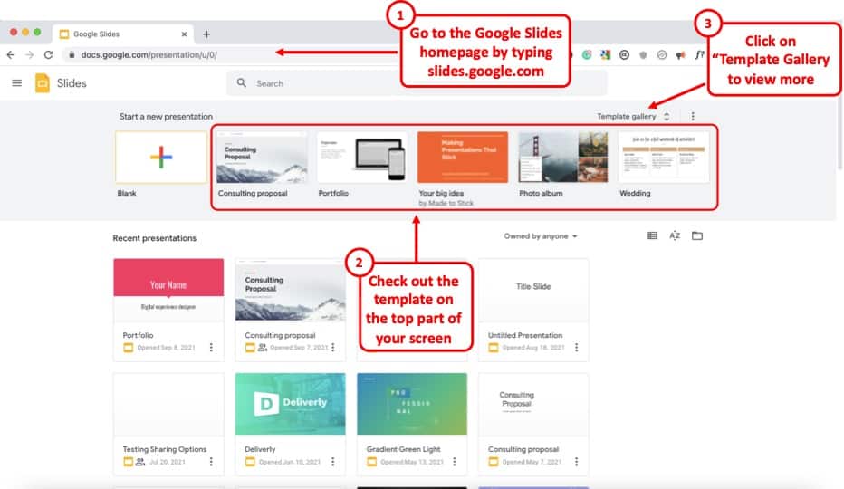
Google Slides already provides you with a number of free templates. Here’s how you can access them –
- First, visit your Google Slides dashboard page.
- Login to your Google Account (if prompted)
- Choose a template from “Start a new presentation” section
- You can also click on “Template Gallery” to view more templates.
The one template that I end up using over and over again is the file name “ Consulting Proposal “. It has got a sleek modern design, a good mix of image slides as well as different text placeholder slide layouts for you to easily edit your presentation.
But, feel free to check out other templates and see which one fits your need the best.
The point here is that if you are not great at designing a presentation, you’d perhaps be better off using a template rather than starting from scratch!
4. Use Fonts the Right Way
When it comes to designing a good presentation on Google Slides (or any application for that matter), fonts do play a key role in how your presentation looks!
Thus, it is important to make sure that you use the fonts correctly when creating your presentation.
Here’s what you need to remember when using fonts for your presentation –
- Use Just One or Two Fonts – Don’t use too many fonts in your presentation. Your presentation design will not look good. Plus, using too many fonts in a presentation shows lack of consistency and professionalism in design.
- Combine Fonts – Ideally, just use one font if you are unsure of which fonts work great together. But, you can also combine fonts to make the content of your presentation standout!
If you do want to go with a two-font option, use the Google Fonts tool to identify the font combination.
Here’s how you can find a good font combination for your presentation –
Step 1 – Visit Googe Fonts and Search for a Font
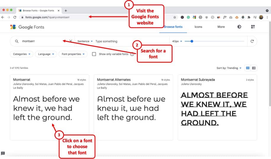
Google Fonts site provides free fonts that are compatible with most modern internet sites and web browsers. Google Fonts are considered the gold standard for sites as these look very modern and are light.
The best thing is – most of them are already available in your Google Slides presentation by default.
So, the first step is to visit the Google Fonts website . Then, search for a font, to begin with. My favorite font is Montserrat . But, you can also go with Lato, Roboto, or Source Sans Pro if you are looking for a Sans Serif Font .
If you are looking for a Serif font , I would recommend using Merriweather .
Step 2 – Choose the Font and click “Pairings”
The next step is to choose a font. You can either type one of the fonts that I mentioned in the search bar and click on it once it appears OR you can also simply choose from the list provided below.
Just make sure that you click on the font that you like to open it.
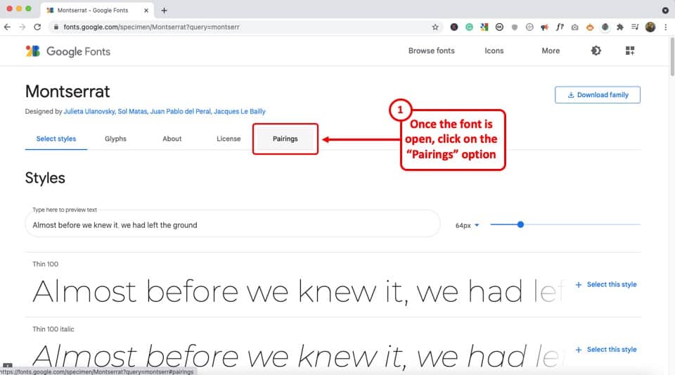
Once the font is open, click on the “Pairings” tab on the top (as shown in the image).
Step 3 – Choose a Font Pair
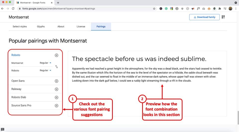
Now simply choose one of the font pairs provided by Google Fonts. You can also click on a font pair to see how it looks on the section on the right.
Play with the options provided and choose the font combination that you like.
Now, simply go back to your Google Slides presentation and change the fonts according to your selection.
5. Choose the Right Color Combination
Just the way fonts are an important part of your Google Slides presentation design, choosing a good color combination can make your presentation look visually appealing, consistent, and professional.
Unfortunately, a lot of struggle with choosing a good color combination. Thus, I highly advise going with a monochromatic color scheme.
A monochromatic color scheme in a presentation provides a variety of color combinations of the same color. This makes your presentation look consistent and professional.
Moreover, using a monochromatic color scheme is a perfect way option for a beginner as it requires the least amount of time and effort to set up!
Check out my other article on using a monochromatic color scheme for presentations to understand the topic in-depth.
Then, also check out how to use the eyedropper tool in Google Slides to implement the color scheme that you end up choosing.
Make sure that you change the color at the theme level in Google Slides instead of changing it on every single slide. This will save you quite a bit of time!
6. Use the Expore Tool to Generate Slide Designs
Once you’ve decided the fonts, color scheme, and theme, and you have the content structured out, you’ve done most of the hard work!
All you are now left to do is create the slide designs. And, to help you with that, make sure that you use the “ Explore Tool ” in Google Slides.
The “Explore” feature in Google Slides generates slide designs based on the content that is already present on the slide. It is a great way to get a slide designed almost instantaneously!
The “Explore” feature in Google Slides works much as the design ideas feature in PowerPoint.
Based on the content on the slide, it will throw a few suggestions on how the content can be laid out on the slide. You can choose the design you like. If not, you can still design your own slide. But, it is definitely worth trying out first. Pretty cool, isn’t it!
I wrote a detailed article on the Explore Feature in Google Slides . Make sure you check out that article to learn where to find this tool and know how to use it!
That said, one thing to keep in mind is that this feature is still an experimental tool . And, while it is getting better with time, I wouldn’t recommend using it with every single slide.
In my experience, I’ve noticed that using the “Explore” feature in Google Slides works best when you want to create a title slide, a section break slide, or just want to get a few ideas on how the slide can be designed.
7. Apply the 3 by 3 Design Rule
The 3 by 3 design rule, otherwise also known as “ the rule of thirds “, is a principle that has been borrowed from photography. But, it is every bit applicable even for slide designs and other design elements!
As per the 3 by 3 design principle, you basically need to divide the visual canvas into 3 equal-sized vertical and horizontal grids with the help of 2 vertical grid lines and 2 horizontal grid lines.
Here’s a video that explains the concept of the rule of thirds for presentations –
Using these grids helps place the content correctly in the grids such that the key message usually aligns with the way our eyes like to see them visually!
The 3 by 3 design principle may seem confusing at first, but once you’ve understood how to use it, you can literally take your presentation design skills a few notches above the rest!
Using 3X3 Grids to Properly Layout Content on your Slides
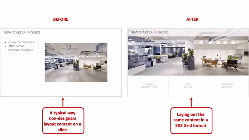
The interesting thing is, you can take the same principle to make it work with elements apart from the images that are present on your slide. And, the results are just amazing!
The picture above shows how most people design their slides (on the left). However, you can literally transform the way your slides look by applying the concept of 3×3 grids to any existing content on the slides! (as shown on the right part of the picture above)
Here’s another video that explains how this concept of 3 by 3 grids can be used to take any existing slides and make them better (if they aren’t properly organized).
8. Use Powerful Images
They say – “An image speaks a thousand words!”. This absolutely holds true when it comes to big impact presentation!
If you recollect any one of the top presentations from Steve Jobs. His presentation was almost always using powerful images with very few words on them.
Using images, as opposed to a lot of text, on your presentation has a few advantages of its own –
- Visual Appeal – Using images makes the slide visually appealing. Think about it – if there aren’t too many objects placed on the slide, the chances of making design related mistakes are also far lower!
- Emotional Connect – Using images creates a subtle emotional connect in the minds of the audience with the topic of the presentation and/or the presenter.
- Audience Focus – When you use text on a presentation, often the audience just reads the text and doens’t want to listen to the presenter. Instead, when using the images, you control the focus of the attention of your audience. Once you have their attention, making a presentation impactful is a lot easier!
- Faster Design Process – In most cases, it is faster to find an image and add it to the presentation rather than think of a way to design a slide to communicate a concept. This is especially true if you have only basic design skills.
If you watch some of the most famous TED or TEDx presentations ( know the difference between TED and TEDx presentations here ), it is quite common to see presenters using high-impact images with text. Ever wonder why is it so?
Well, one of the most important reasons is that you are able to control the attention of the audience!
Now, if you are wondering how to find images for your presentation, keep reading as I’ve got some great recommendations for add-ons later in the article!
9. Keep the Text on the Slide Readable
If using images for most slides is not the way for you, then this section is going to be quite important!
In fact, even if you do plan to use just images on your slides, there may still be a few slides where you will need to have some text. If so, make sure that the text on the slide is readable!
Make sure that you don’t use text that is too small to read.
As a general rule – the further the audience is going to be away from the screen, the larger the size of the text!
Here’s what to remember for the size of the text on the slides –
- Presentation seen on a computer screen – If the presentation that you are designing is going to be seen on a computer screen (either over an email or a zoom call), then make sure that the font size used for the presentation is not less than 16 points .
- Presentation seen on a large screen – If the presentation is going to be delivered in an auditorium, then it is recommended to use a font size no less than 30 points . For the rest of the situations, anything in between should be fine!
Also, make sure that you don’t use too much text on the same slide. Remember – you only need to cover one key topic on one slide.
It is totally okay to just use one word in the middle of the slide, and talk about that topic rather than using text from a complete word document on a slide!
If your audience will have to squint to read what is written, it just creates a bad user experience and they quickly lose interest.
Also, for the above reason, don’t include everything on the slide that you plan to say! If you do so, you may come across as a person who is just reading from the slide! Most importantly, the audience is going to end up reading the text from the slide faster than you speak, and end up losing interest in the presentation!
10. Ditch the Bullet Points (Use Infographics Instead!)
Using bullet points on a presentation is so 1990s! It’s just not the way good presentations are given anymore!
If you want your presentation design to look good, make sure that you get rid of bullet points. Instead, you can either use images, icons, or even infographics!
I’ve written an entire article on how to use infographics in Google Slides where I also talk about SmartArt and charts in Google Slides. Make sure you check out that article!
There are a ton of different ways in which you get infographics for Google Slides. I’ve talked about that also in the same article that I’ve linked above.
Likewise, you can also use icons instead of bullet points. Although adding icons to Google Slides is not an option that is available by default, there are a few ways you can work around this problem. For instance, you can use an add-on like “Flaticon” that provides free icons for Google Slides!
If you are wondering how to create a slide with bullet points and use icons or other methods, here’s a good example of an actual client slide that I redesigned –
As you can see on the image, simply using icons and structuring the text to give proper hierarchy to the information can make all the difference to the design of the slide!
In case you don’t want to use icons, you can also use numbers with circles, and use a similar design instead of just adding bullets to your presentation. If you do so, your presentation will still look good!
11. Avoid Using Just Table or a Graph
The next tip to remember is to avoid using just a table or a graph on a slide. Make sure that you also include a few points that act as key takeaways from the information that you provide.
Using just a table will present a lot of information on a single slide. This will definitely cause an information overload. And, even though your audience may be able to assess what is being presented to them, it is important to either highlight key pieces of information in the table or a graph.
Alternatively, you can also add a couple of lines of text indicating the key learnings from the data set.
Don’t get me wrong, it is important to have data sets on a presentation if you have one! But, just make sure that you also highlight key pieces of information that your audience should pay attention to.
12. Keep Animations and Transitions Subtle
Another design tip that you should keep in mind is the use of animations and transitions in Google Slides.
You want to make sure when using animations in Google Slides , you don’t add any funny movements. Think old school when using animations and transitions in your presentation.
Any additional movement or sudden transitions can distract the attention of the audience from the core topic and the messaging of the presentation.
So, make sure that you keep the use of such animations or transitions to the minimal!
13. Use Professional Google Slides Templates
If you find that the free template doesn’t have enough slide layouts for your presentation or doesn’t really fit the topic of your presentation, you may want to consider using professional templates!
There are a ton of different ways you can get templates for Google Slides. Unfortunately, most of the free options (and even most paid options) have outdated designs!
My personal favorite method for getting amazing Google Slides presentation templates is using Envato Elements .
The best part about using Envato Elements is that not only does it provide you with the best-in-class designs for your templates, but it also provides you with an option to download an unlimited number of presentations! (yes, you hear that right!)
Moreover, the pricing of Envato Elements is also really affordable! All you need to do is click on Envato Elements to visit the website, view the templates, and click on the “ Get Unlimited Downloads ” button on the top.
You will be prompted to sign up and pay a subscription. Just go for a monthly subscription and pay for one month (You can easily remove the payment method and cancel your subscription anytime).
Once you’ve logged in, simply cancel your subscription. Your subscription will be valid until the next date of renewal even if you cancel it.
Now, for the one month that you’ve paid, feel free to download all the templates that you like including templates for Google Slides, and PowerPoint!
14. Use Add-ons for Faster and Better Designs
One of the challenges with Google Slides, as opposed to some of the most reliable presentation design software, is the limited number of features it offers.
I suppose we should not really be complaining about it given that we do get a great presentation design application for free along with several additional advantages with Google Slides ! That said, you do feel the need for a few pro-features that PowerPoint has to offer.
However, one way to fix this problem is to use add-ons with Google Slides!
Using add-ons allows you to use third-party tools and bring additional functionalities to your Google Slides presentation!
Add-ons on Google Slides are easy to add. Simply go to the Google Marketplace, and search for the add-on that you would like to add. Install it, and you are done!
Check out my complete guide on using Add-ons on Google Slides where I not only talk about how to use add-ons in Google Slides, but I also provide you with my personal favorite top 5 recommendations of add-ons that you should be using in Google Slides!
15. Hire a Professional
Well, the last tip is not so much as a tool that you can use on Google Slides. But, it is a great hack to ensure that you create great presentation designs!
Simply hire a professional to do the design work for you! You may be wondering that hiring a presentation professional might be difficult. However, that is not the case.
You can easily find some really good presentation designers on Fiverr , and you can start at as little as $5 to $10 dollars per slide! I’ve personally used freelancers from the site, and although finding a good freelancer may take you 15-20 minutes, you can easily outsource your work and let the designer worry about the rest!
The best part is – you don’t have to pay a single penny to hire a professional. You only pay to get the work done!
There are a ton of other platforms to hire professionals that can design a good presentation for you. However, I have found Fiverr (especially for presentation design work) and Upwork to be the most effective.
A Few Things to Remember When Delivering the Presentation
Once you have created an amazing Google Slides presentation, you are perhaps ready to deliver the presentation. However, I’d like to also share a couple of tips that can be helpful when you plan to give the presentation!
So, here they are –
1. Use a Presentation Remote
It doesn’t matter whether you are giving a presentation in an auditorium or online through Zoom or Microsoft Teams.
Using a presentation remote helps you keep your hands free and allows for free movement and hand gestures. This does help engage with your audience.
Check out my other article on using presentation clickers with Google Slides where I provide you with a few tips and recommendations on which remote you should go with.
2. Use the Q&A Tool in Google Slides
A unique feature that Google Slides provides is the Q&A tool. This is great especially if you are delivering a webinar-style presentation or if you are simply addressing a large gathering.
This tool allows your audience to send questions during the course of your presentation. Then, at the end, you can simply view the questions in the Q&A session and answer them one by one!
It is a great way to deliver an engaging presentation using Google Slides!
Credit to cookie_studio (on Freepik) for the featured image of this article (further edited).
WHITNEY D. WALTER

PowerPoint Made Easy with the 5 5 5 Rule
Whitney D. Walter
Looking for an easy way to create a more compelling PowerPoint presentation? Look no further than the 5 5 5 rule! This simple guideline makes it easy to lay out your slides in a clear, organized way that draws attention to the most important information.
Experts suggest that using this method – one of the many similar ones out there – will result in a better experience for your audience and better results for you as a presenter.
It can keep you from feeling overwhelmed.
Use images or icons to tell the story., what exactly is the 5 5 5 rule.

Simply put, the 5 5 5 rule (often written as the 5/5/5 or 5-5-5 rule) means that on each slide you should have no more than 5 lines of text. Within each line, there should be no more than 5 words. And finally, there should be no more than 5 text-heavy slides in a row.
5/5/5 Rule Powerpoint Example

Benefits of Using This Rule
Using this simple rule allows you to limit the amount of text on your slides which can be beneficial for many reasons.

You can focus on the main points.
Instead of putting all of your detailed ideas on each slide, this rule reminds you to focus on the main ideas and stops you from committing a major PowerPoint faux pas – reading directly from the screen.
Why shouldn’t you read from the slide?
First, directly from your presentation creates an extremely boring experience for your audience. They came to see you, not to read along with a slide.
Second, it’s often very difficult to read from a slide anyway, so you’re likely to make mistakes or lose your place.
Third, and most importantly, it takes away your chance to make eye contact with the audience and connect with them on a personal level.
So next time you’re giving a presentation, remember not to read directly from the PowerPoint slide – it’ll be better for both you and your audience.
And an added bonus? When you aren’t reading directly from the slide, you are encouraged to explain your ideas through storytelling which is a much better way to relay information.
In fact, studies have shown that our brains naturally look for stories and patterns to help us understand information.
Your audience will be more engaged.
Since your audience won’t be busy reading all of the text on your slide while you’re presenting, they will be more inclined to actually listen to what you’re saying.
Better yet, they will have the opportunity to be more engaged by responding to the things you’re saying or asking questions.
Remember, more than five text-heavy slides in a row will simply be a distraction for your audience and a guaranteed way to lose their interest.
You’ll end up with more professional-looking presentations.
If you’re looking for a quick and simple way to make your presentation look more professional the first thing you should do is evaluate whether you are using an unnecessary amount of text.
Professional presentations typically use clean and easy-to-skim designs. This means taking advantage of negative space (aka purposely leaving empty space on the slide).
If you’ve ever had to create a presentation in rush you know how stressful it can be.
The same is true for those who are new to using PowerPoint and those who are simply not comfortable with its capabilities.
Using this rule can make creating a presentation much less stressful because it gives you a guideline to work off of.
It also minimizes how much time you’ll spend on adding content to the slide because you know that each slide will have no more than 25 total words. (5 lines of text with 5 words each=25 total words.)
If you’re not sure where to start, add your thoughts for each slide to the Notes pane first and then copy/paste only the most necessary information to the actual slide.
How to Use This Rule Effectively
Include high-level, key data points..
Not sure what to include for the “main points” mentioned above? Think about the 5Ws; who, what, where, when, and why.
Try to avoid including information that doesn’t answer one of these questions.
Use headings, short phrases, and common abbreviations.
Using a heading is a great way to summarize the information that will be shown on a particular slide.
Within the slide, locate any complete sentences and determine whether they can be summarized with a short phrase instead.
Here’s an example.
Full Sentence: Our annual earnings were up 10% compared to last year.
Summarized: Annual Earnings: +10% YOY
(In this example, YOY means “year-over-year” which is a frequently used abbreviation in business.)
As you can see, the summarized version allows you to use less text. It also makes it easier for the audience to retain information and recall it later.
You can also remove text from your slide altogether by replacing it with images, icons, or easily recognizable symbols.
There have been numerous studies that show audiences remember information supported by images at a far higher rate than those told with text alone. Use this to your advantage!
Similarly, icons and symbols can easily replace text in many situations.
For example, text that says “this is important” can be replaced with a caution symbol. Text that says “key dates” can be replaced by a calendar icon.
Other Related Questions
What is the 2 4 8 rule in PowerPoint?
The 2 4 8 (also seen as 2/4/8 or 2x4x8) rule is another similar technique used by presenters to organize their slides.
This rule states that you shouldn’t spend more than 2 minutes presenting each slide. Each slide should contain no more than 4 main ideas or bullet points. Each idea or bullet should have 8 words or less.
This approach helps presenters to stay focused on their key points and avoid getting lost in too much detail or extraneous information.
By prioritizing the most important messages, you can ensure that their audiences will take away from the presentation only the most essential information.
What is the 10 20 30 slideshow rule?
The 10 20 30 (or 10/20/30) rule is another set of guidelines for creating effective presentations.
This rule means that your presentation should contain 10 slides total slides, last no more than 20 minutes, and use a font size of no less than 30 points.
The 10/20/30 rule was created by Guy Kawasaki, a venture capitalist and it has since been adopted by many business professionals.
While it’s not a hard-and-fast rule, it is a good general guideline to follow when creating presentations.
What is the rule of 7 in PowerPoint?
Also called the 7×7 rule, it means that for every slide, there should be no more than 7 lines of text or bullet points and no more than 7 words per line.
What is the 6 by 6 rule?
It is nearly identical to the 7×7 rule mentioned above. The 6 by 6 rule (or 6×6) means that for every slide, there should be no more than 6 lines of text or bullet points and no more than 6 words per line.
How many slides is a 5-minute presentation?
Generally speaking, a 5-minute PowerPoint presentation should have somewhere around 5 to 7 slides . This is an ideal number because it strikes the right balance between being concise and providing enough information to engage your audience.
Ultimately, how many slides you need in your presentation will depend on a variety of factors, including the nature of your topic and the specific goals of your presentation.
But with careful planning and clear communication, you can create an effective 5-minute PowerPoint that will help you achieve your objectives and “wow” your audience.
How do you plan a 5-minute presentation?
Planning a 5-minute presentation can be daunting and you might be wondering “how many slides should a 5-minute presentation be?”.
Here are a few steps you can take to make sure you make the most of your time.
First, determine the purpose of your presentation . Are you trying to educate, entertain, or persuade your audience?
Once you know the purpose of your talk, you can begin to plan what to include.
It is important to be concise and clear in your presentations, so plan to focus on just one to three main points . Make sure that you can provide a quick but impactful story (or any supporting evidence) to drive each point home.
Finally, practice your presentation several times before delivering it . This will help you ensure that you stay within the time limit and that your talk flows smoothly while also making sure you don’t forget any important details.
By following these tips, you can plan an effective 5-minute presentation that is sure to engage your audience.

Time to clap it up because you’ve just added some serious productivity-boosting info into your PowerPoint toolkit. Want to dive into even more tips for reducing text? Download the full, free cheatsheet here.
The 5/5/5 rule is a powerful tool for creating effective PowerPoint presentations. It can help you to summarize your ideas, makes your slides more visually appealing, and can even result in increased audience engagement during your presentation.
So when it’s time to draft your next presentation, keep the 5/5/5 rule in mind. It may take a bit of patience to get the process down but, once you do, you’ll see what a significant difference it can make.
Have you used this rule – or similar rules – when creating presentations? Do you know of any other rules that help with efficiency and design? Drop a comment below and let’s talk about it!

Whitney is a recognized Professional Development Expert, professional speaker, and the founder of Harness Your Power. She holds a Master’s in Business Administration from Florida State University and a Microsoft PowerPoint Specialist certification. She has been featured in Yahoo Finance, AOL, Authority Magazine, Business Insider, Fox and more. Read more.
Similar Posts

3 Quick Ways to Embed an Excel File in PowerPoint
When I talk to other PowerPoint users, one of the common statements I hear is “I know there’s an easier way to do it but this is the only way I know”. Whether we’re talking about creating templates, adding video, or exporting to PDFs – this statement is likely to make its way into the conversation. The…

Random PowerPoint Timesavers: Part 1
What if I told you I could give you eight and a half hours back in your workweek? What would you do with this time? Create a plan for your next promotion? Take advantage of a four-day workweek? Perhaps, you’d simply be happy to make it home in time for dinner with the family. The…

PowerPoint for New Audiences
PowerPoint is a great way to get in front of new audiences. Whether you’re creating stellar presentations behind the scenes or presenting to groups outside of your normal range, you can go from unknown to having raving fans when done right. Either way, these tips for creating PowerPoints for new audiences will help you succeed…

How to Add Notes to PowerPoint & Increase Efficiency
If you’ve always wondered how to make your PowerPoint presentation flow more smoothly or wished you could save time by eliminating the need to create detailed outlines and notecards- presenter notes are just what the doctor ordered. Mastering how to add Speaker notes to PowerPoint is a great way to achieve these goals and increase…

PowerPoint Agenda Slide: What It Is & Easy Ways to Make One
If you’ve been creating Microsoft PowerPoint presentations for a while, you already know the benefits of starting with a good agenda. As a presenter, it allows you to take control of the conversation from the very beginning. You’ll also have the ability to eliminate audience distractions by clarifying the meeting objective and pointing out when…

How to Add, Align & Delete Text Boxes in PowerPoint
PowerPoint allows you to add a text box to any slide so you can have more control over the placement of your text. Once you’ve added a new text box, you’ll have a variety of formatting options. If you chose to delete a text box, it can be done in just a few clicks. You…
Privacy Overview

Rob Williams
Data Scientist
- Google Scholar
Better Beamer Presentations the Easy Way
October 01, 2019 9 minute read
Everyone knows that Beamer makes frankly terrible presentations without a good deal of help. A well crafted Beamer presentation can be a thing of beauty, especially since you can use knitr or R Markdown to automatically generate tables and figures, but it takes a lot of work. We all have our own little tricks to do things like get more space between items in a list (ending every \item line with \\~\\ ) and the simple but repetitive tasks we have to do every single slide (opening a \Large environment to make text more readable).
Three little tricks
I finally got tired of all this and decided to waste a lot of time now to save even more time later. To do that, I headed to Stack Exchange and started digging into the Beamer documentation.
Give me some space
We’ll start with the base Beamer class. There are a number of Beamer themes that are much better than the default theme, but I’m going to focus on things we can do to improve even the default theme. Here’s our humble starting point.

The first thing anyone who’s ever taken a graphic design class will tell you is that we need to space out those lines. With them all crammed in the middle, they’re harder to read and there’s ton of empty space up top and down below. We can insert a \vfill at the top and bottom of the slide, and between each line, but this gets old quickly. After plenty of googling and a few less than perfect solutions, I came across this Stack Exchange answer . By adding the following code to your preamble, any items in a \itemize environment will be evenly spaced vertically.

Looking better already!
Super size it
Next we need to enlarge our text to make it easier to read. Again, we can do this manually on every slide, but that’s a giant pain. I found this old thread on latex.org which explains how to redefine the font size of \itemize and \enumerate items.
While this has fixed the font size of our lists, now our still too small equation will look even more out of place. I learned from this Stack Exchange answer that the \[ and \] math mode separators actually call the equation* environment. With this knowledge, I used the etoolbox package’s \BeforeBeginEnvironment and \AfterEndEnvironment commands to change the font size to LARGE for any equation* environments.

Now we’ve got a much more readable slide that will be automatically replicated for every other slide in our presentation. If you have multi-line equations in your slides, you can similarly redefine the align* environment to enlarge these equations as well.
Don’t forget numbers
As we can see above, our redefinition of the \itemize environment also evenly spaces sub-bullets. However, it doesn’t do anything for numbered lists defined with /enumerate as the slide below shows.

To evenly space items in numbered lists, we just need to take the same changes to the \itemize environment we introduced above, and apply them to the \enumerate environment as well. Unfortunately, I’m not nearly fluent enough in TeX to understand what this code does. Luckily, I know how to run a diff . Diffing two files will point out all differences between the two. By comparing the modified code from Stack Exchange with the original in beamerbaselocalstructure.sty , we can figure out which lines have been added and copy them over to Beamer’s definition of the \enumerate environment.
Essentially, the new code redefines the \itemsep length parameter as \vfill and adds a \vfil at the end of an \itemize environment. \vfil and \vfil are both commands to create vertical space, and this Stack Exchange answer explains the difference between them, but I still have no idea what the difference is after reading it. What matters is that the \enumerate environment definition looks identical to the \itemize one in the lines surrounding the new code (with the substitution of \endenumerate for \enditemize ), which makes it easy to add it to this definition as well.
Once we’ve done that, now numbered lists are also evenly spaced!

All together now
Sticking all of the below in your preamble will greatly improve the visual appeal of your slides with zero effort required on each individual slide.
I’ve combined all of the LaTeX code above into a style file called better-beamer.sty available on my GitHub. To avoid having to copy and paste this code into the preamble of every presentation you make, you can just load the style file instead! If you place the style file into the same directory as your .tex file, you just need to add:
If you want to avoid having to copy the style file every time you make a new presentation, you can just use an absolute path to reference it in your .tex document. On my computer, this looks like this:
One caveat if you use R Markdown like I do. R Markdown relies on pandoc to convert from .Rmd to .md to .tex to .pdf (phew). This only matters if you’re a lazy typist like me and write your
When you write your lists in the former format, pandoc redefines \itemsep to 0pt in any list (bulleted or numbered) environment in the the resulting LaTeX code via the following command:
This will cancel out our redefined list environments and get us back our original cramped lines. There’s no way to disable this \tightlist behavior (short of removing it from the source code and compiling pandoc yourself), but it is very easy to neutralize thanks to the info in this Stack Exchange answer . If you’re using R Markdown, simply add the following to your YAML header under the header-includes variable.
This will come after the \tightlist definition in the preamble and redefine it to do nothing, leaving our properly spaced lists intact without having to add an empty line after every item. At some point I’ll post my custom LaTeX template (with other aesthetic improvements) for Beamer slides via R Markdown and talk about my process for modifying the default template.
You May Also Enjoy
Adding content to an academic website.
August 07, 2020
One thing I haven’t covered in my previous posts on creating and customizing an academic website is how to actually add content to your site. You know, the stuff that’s the reason why people go to your website in the first place? If you’ve followed those guides, your website should be professional looking and already feeling a little bit different from the stock template. However, adding new pages or tweaking the existing pages can be a little intimidating, and I realized I should probably walk through how to do so. Luckily Jekyll’s use of Markdown makes it really easy to add new content!
Customizing an Academic Website
July 06, 2020
This is a followup to my previous post on creating an academic website . If you’ve followed that guide, you should have a website that’s professional-looking and informative, but it’s probably lacking something to really make it feel like your own. There are an infinite number of ways you could customize the academicpages template (many of them far, far beyond my abilities) but I’m going to walk you through the process I used to start tweaking my website. The goal here isn’t to tell you how you should personalize your website, but to give you the tools to learn how to implement whatever changes you want to make.
Building an Academic Website
June 30, 2020
If you’re an academic, you need a website. Obviously I agree with this since you’re reading this on my website, but if you don’t have one, you should get one. Most universities these days provide a free option, usually powered by WordPress (both WashU and UNC use WordPress for their respective offerings). While these sites are quick to set up and come with the prestige of a .edu URL, they have several drawbacks that have been extensively written on .
PowerPoint Tips Blog
Helping you with presenting, PowerPoint, and speaking
3 techniques for putting less text on your slides
October 18, 2021 by Ellen Finkelstein 2 Comments

Even if your content is valuable and interesting, the text makes it LOOK boring.
Also, research has shown that images attract more attention.
So the solution is almost always to replace text with images and not put everything you say on the slide.
How do you present without the text?
Presenting without the text on the slides can get some people nervous. Presenting without the text means you have to do one or more of the following:
- Use Presenter view to see your notes (put what you’ll say in the Notes pane in PowerPoint)
- Use written notes or cards
- Practice so you know what you’ll say without seeing the text on the slide
Here are 3 ways you can get most of that text off the slide…
1. Replace text with icons
Icons are very popular these days. They are symbolic, representative graphics and can replace text. PowerPoint comes with a lot of icons (Insert, Pictures, Stock Images, Icons) or you can find icons elsewhere. Ideally, the icon is immediately recognizable so that people know approximately what you’ll say. Of course, the icon can be a prompt for you, too.

In this example:
Here are some advantages of the makeover:
- The slide looks a lot less busy
- People have to listen to you because they won’t understand the meaning until you explain it to them (but then it should be clear)
- People will remember the images more than the words, so the points will stick with your audience longer
2. Replace text with photos or other graphics
This technique also involves replacing text with images, but not icons. Here you see a list of products and I’ve replaced the list with product images. You may have seen slides or websites that show customer logos. While the logos usually also include the company name, in my example, the title of the product is not always as obvious.

In this case, the slide still looks busy, but that’s actually the point — there are so many products! The product images are a lot more interesting and people will remember them more than the list of product titles.
3. Remove indented text (sub-bullets)
You’ve probably seen slides with bullets, sub-bullets, and maybe sub-sub-bullets. Even if you make it look “pretty” with SmartArt, it’s too much and you can often just leave out the indented text (sub-bullets).
In this example, I also added icons.

First, there’s less text. Second, the icons help people remember the points.
There are other things you can do to make the slide prettier or more memorable, such as add a photo of a happy person in the background. After all, people are happy to save money, save time, reduce risk, and fulfill their desire to get their knowledge out to the world.
What to do next
Make over some overly wordy slides using these techniques and practice delivering them without all of the text on the slides. Does this work for you?
My High-Persuasion Presentation Program teaches a system of designing slides that is easy for non-designers and will reduce the amount of text you put on a slide.
Check it out here .
Please ask a question or leave a comment below and use the share buttons below to inform your colleagues about these techniques.
Related posts:
- Making text stand out with text formatting techniques
- 3 text animation techniques
- Combine animation techniques to create stunning PowerPoint slides
- Do you present with printed slides? What if your slides were the size of your paper?
2 Leave a Reply
Great points Ellen. Personally I prefer to always combine an icon with one or two keywords, as their intended meaning may get lost on people quite quickly.
Also: to get less text on slides, I always go back to the big ‘Divide and Conquer’: is there truly only one message on the slide? Otherwise, we split them up into multiple slides. Slides are free, so it’s a great way to keep focus.

[…] Source link […]
Sign up for our daily newsletter
- Privacy Policy
- Advertise with Us
Useful Tips to Reduce a PowerPoint Presentation File Size

PowerPoint presentations generally contain a large number of images, videos, gifs, charts, and other visual content. This makes the files very large and difficult to work with.
Large files take up a considerable amount of disk space, and they push the limits of the data you are allowed to send via email. Even if you put your file in cloud storage, the file can be slow to respond when the recipient uses it.
To get the best performance from a PowerPoint file, you need to keep the document size under control. There are many different ways you can keep the extra, and mostly unnecessary, information from blowing up the size of your presentation.
Also read: 8 Alternatives to Microsoft PowerPoint You Need to Try
Edit Images in an Image Editor
Although PowerPoint gives you the option of editing the images in your presentation within the program, it adds extra bites of information. For example, if you change the color of an image to black and white, the file still contains the color image. If you edit many images in PowerPoint, you can add quite a bit of extra data.
Instead, use an external image editor to make the changes to the image before inserting it into the presentation. There are image editors available online to make these edits. If you add all the pictures before you make any changes, you can tell PowerPoint to discard all the extra data created during the edits.
1. Click on File -> Info.

2. Click “Check for issues.”

3. Select “Inspect Document.”

4. In the Inspect Document window, check at the following boxes at the very minimum:
- Comments, Revisions, Versions, and Annotations
- Document Properties and Personal Information
- Invisible Content
- Hidden Text

5. Click Inspect.
6. After the inspection finishes, click “Remove all” to remove the extra information added through editing the images.
Also read: 14 Useful PowerPoint Templates to Set Up a Digital Planner
Compress Images
Because the images take up a large amount of space in a PowerPoint presentation, you want to make sure they are as small (in data) as possible. To do this, either compress all the images or only the largest ones.
1. Click on the File tab and select “Save As.”

2. Click on “More options” under the File type drop-down box.

3. In the Save as window that appears, click the word Tools next to the Save button.

4. Select “Compress Pictures.”

5. In the Compress Pictures box, choose the resolution you prefer. (150 ppi is best for presenting.) Make sure the box for “Delete cropped areas of pictures” is checked (unless there is a chance you may want to recover the cropped portions from your images..

6. Click OK.
To compress only specific images in the presentation:
1. Click on the image you want to compress.
2. On the menu ribbon click the “Picture Tools -> Format” tab. Click “Compress pictures.”

3. In the window that appears, select your preferred resolution from the low end of the options.
4. Make sure “Delete cropped areas of pictures” is checked.

5. Click OK.
Insert Images
If you copy and paste images into your slide show by using Ctrl + C and Ctrl + V or by dragging and dropping them, PowerPoint may change the format of those pictures to either a PNG or a BMP. These formats are larger than a JPG of the same image.
Tip: Learn more PowerPoint keyboard shortcuts to speed up your workflows.
Insert your images using the Insert image option on the PowerPoint menu.

The image will remain in its original format, possibly saving you some extra data.
Don’t Embed Fonts
Embedding fonts includes special fonts in the presentation as part of the document. Unless the font is of particular importance to the theme of the presentation, consider using standard fonts and turn off the option to embed them.
1. Click on the File tab and click Options at the bottom.

2. In the options box click on the Save tab. Untick the box that says “Embed fonts in the file.”

3. Click OK.
Link to Videos
If you are not sending the presentation to someone else, you can save a large amount of data by linking to videos instead of embedding them. Click on the Insert tab and on the Video button to see your options.

Compress media
Lastly, to reduce the size of the presentation as much as possible, compress the media files using the file menu.
1. Click on “File -> Info.”
2. Click on Media Size and Performance.

3. Select the quality you want from the choices. Internet Quality is usually enough for most presentations.

4. Once you select the quality you want, the compression begins.
The next time you need to create a PowerPoint presentation to share with others, take some or all of these steps to ensure a smaller file size. It will run more smoothly and be easier to send electronically.
Our latest tutorials delivered straight to your inbox

Tracey Rosenberger spent 26 years teaching elementary students, using technology to enhance learning. Now she's excited to share helpful technology with teachers and everyone else who sees tech as intimidating.


- How to Make Your Slides Not Look Like PowerPoint
Data Viz – How Close Are We to a Budget Deal?
The greatest storyteller of all time.
I’ve heard a lot of advice on how to make your slides look more professional. But one of the best pieces of advice is this: try to make your PowerPoint slides not look like PowerPoint slides.
One of the easiest ways to do this is to choose a different font. By default, PowerPoint will offer you Calibri. And by default, your slides will look like every other PowerPoint slide. Yaawn.
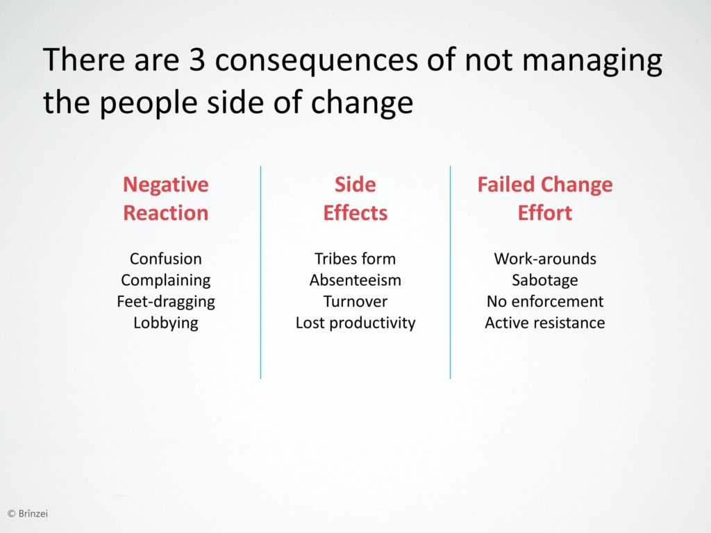
But you can make a better impression on clients, colleagues and students if you’ll choose a different font. I like to use Rockwell for the titles and Segoe UI for the body. You can change the font in the slide master.
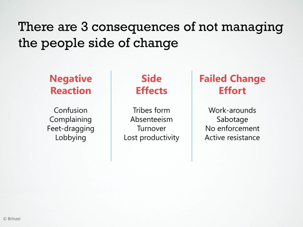
Oh, by the way. You may be wondering about that lovely slide background. What is that? It’s simply this photograph on Flickr , shared via a Creative Commons License from the photographer Brinzei. I had to adjust the transparency to mute the image a bit, then crop out the trees at the bottom. Changing your background to a textured background is another great tip for making your slides not look like PowerPoint. I’ve created this video showing you how to make textured backgrounds.

About the author: Bruce Gabrielle is author of Speaking PowerPoint: the New Language of Business , showing a 12-step method for creating clearer and more persuasive PowerPoint slides for boardroom presentations. Subscribe to this blog or join my LinkedIn group to get new posts sent to your inbox.

speakingppt
Related posts, 6 steps to a snazzier title slide, do your powerpoint slides have a clear visual path, make slides that pop using color contrast – powerpoint video tip #18.

Why a cropped photo for the background if you could easily get that same visual effect using powerpoint resident tools?
Hi Miguel – What resident tools will give you a textured background like this?
— Bruce
To “replicate” this special case, you can insert a shape, fill it with a gradient, copy and paste it as a picture (paste options/as picture), under “format picture/artistic effects” apply the texture of your choice, adjust with any “Picture Corrections” or “Picture Color”…
You can redo all the copy & paste process and apply textures over textures…
Oops… forgot to add this example made before your suggestion: http://tinyurl.com/q697wkw
Very cool. So 1. Create a radial gradient 2. Copy and paste it as a PNG file 3. Use Format > Artistic Effects to add a texture 4. Repeat the copy/paste-as-PNG and artistic effects adding textures on top of textures
That’s another useful way to create a textured background.
— Bruce Gabrielle
Doesn’t even need to be a gradient or specify PNG.
It can be done with anything you create from PP’s “Insert” menu, text included.
Simply copy & paste “your” previously edited or customized shape.
The icon which appears in the right-bottom corner of the placed shape “Paste Options (Ctrl)” will offer two options: “Use Destination Theme (H)” which will keep it as is (well not simply that) or “Picture (U)” which will paste an image.
Then you’re free to process it with any PP resident “Picture Tools”…

I have found lately that I just tell a story using pictures. No words. Participants seem to remember the highlight points a lot easier. Also generates talking points and much more discussion. Many sites for free iphotostock as well as using my iPhone to take specific/relevant pictures for the topic that nay be field related.
That may work for some presentations. But not others.

Hi Bruce, Thanks for the article. Quick question – are Rockwell and Segoe UI available as commonly on all computers (- like Times or Arial)? If not, using the same might end up not showing properly on clients’ system. Thanks and regards, Amit Kapoor
Segoe UI will work on any computer with Office 2007, 2010, Vista or 7. I don’t believe it works on Mac.
Not sure about Rockwell. You can save your presentation with the fonts embedded so even if they don’t have that font installed, it will still show up as if they did. The instructions for doing this are different for different versions of PowerPoint .
Biden administration plans to reclassify marijuana, easing restrictions nationwide
WASHINGTON — The Biden administration will take a historic step toward easing federal restrictions on cannabis, with plans to announce an interim rule soon reclassifying the drug for the first time since the Controlled Substances Act was enacted more than 50 years ago, four sources with knowledge of the decision said.
The Drug Enforcement Administration is expected to approve an opinion by the Department of Health and Human Services that marijuana should be reclassified from the strictest Schedule I to the less stringent Schedule III. It would be the first time that the U.S. government has acknowledged its potential medical benefits and begun studying them in earnest.
Attorney General Merrick Garland submitted the rescheduling proposal to the White House Office of Management and Budget on Tuesday afternoon, a source familiar with the situation confirmed.
Any reclassification is still months from going into effect. After the proposal is published in the Federal Register, there will be a 60-day public comment period. The proposal will then be reviewed by an administrative law judge, who could decide to hold a hearing before the rule is approved.
What rescheduling means
Since 1971, marijuana has been in the same category as heroin, methamphetamines and LSD. Each substance under the Schedule I classification is defined as a drug with no accepted medical use and a high potential for abuse. Schedule III substances include Tylenol with codeine, steroids and testosterone.
By rescheduling cannabis, the drug would be studied and researched to identify concrete medical benefits, opening the door for pharmaceutical companies to get involved with the sale and distribution of medical marijuana in states where it is legal.

For the $34 billion cannabis industry, the move would also eliminate significant tax burdens for businesses in states where the drug is legal, notably getting rid of the IRS' code Section 280E, which prohibits legal cannabis companies from deducting what would otherwise be ordinary business expenses.
The Justice Department’s rescheduling decision could also help shrink the black market, which has thrived despite legalization in states like New York and California and has undercut legal markets, which are fiercely regulated and highly taxed.
Years in the making
President Joe Biden directed the Department of Health and Human Services in October 2022 to review marijuana’s classification. Federal scientists concluded that there is credible evidence that cannabis provides medical benefits and that it poses lower health risks than other controlled substances.
Biden even made history in his State of the Union address this year, for the first time referring to marijuana from the dais in the House chamber and making note of the federal review process. “No one should be jailed for using or possessing marijuana,” he said.
When Biden was vice president in the Obama administration, the White House opposed any legalization of marijuana, saying it would “pose significant health and safety risks to all Americans.”
Jim Cole, who was deputy attorney general in the Obama administration, wrote the famous Cole Memo in 2013 , paving the way for the modern marijuana market. The memo scaled back federal intervention in states that had legalized marijuana as long as they implemented “strong and effective regulatory and enforcement systems to control the cultivation, distribution, sale and possession of marijuana.”
Cole, who is now a member of the National Cannabis Roundtable, said in an interview this week that reclassifying marijuana to Schedule III would “open up the ability to actually test it and put it in a laboratory without all of the restrictive measures” of a Schedule I drug.
Kevin Sabet, president and CEO of Smart Approaches to Marijuana and a former Obama administration adviser, said the decision to reclassify marijuana is "the result of a politicized process," arguing that it "will be devastating for America’s kids, who will be bombarded with attractive advertising and promotion of kid-friendly pot products."
"The only winner here is the marijuana industry, who will receive a new tax break and thus widen their profit margins," Sabet said. “Reclassifying marijuana as a Schedule III drug sends the message that marijuana is less addictive and dangerous now than ever before. In reality, today’s highly potent, super strength marijuana is more addictive and linked with psychosis and other mental illnesses, IQ loss and other problems.”
Researchers have raised concerns about high-potency marijuana and cannabis-induced psychiatric disorders, particularly among young men.
Some challenges ahead
Once the DEA formally makes its announcement, the marijuana industry would see an immediate benefit. But with the DEA’s proposed rule change comes a public review period that could lead to a challenge, and perhaps even a change, to the rescheduling proposal.
Once the public comment period has concluded and the Office of Management and Budget reviews the decision, Congress would also be able to overturn the rule under the Congressional Review Act, which gives it the power to weigh in on rules issued by federal agencies. Democrats control the Senate with a 51-seat majority, and for an overturn under the CRA to succeed, two-thirds of the House and the Senate would be needed to support it, meaning the marijuana rescheduling would most likely survive.
Though cannabis remains a divisive topic on Capitol Hill, there has been growing support on a bipartisan basis for marijuana reforms, largely driven by the electorate. Nearly 6 in 10 Americans say marijuana should be legal for medical and recreational purposes, according to a Pew Research poll last month. Cannabis is legal in 24 states for recreational use.
Congress is considering its own bills
Congress is considering its own measures that would make it easier for legal marijuana businesses to thrive and allow for more small and minority-owned shops to flood the marketplace.
The SAFER Banking Act , for example, which would grant legal marijuana businesses access to traditional banking and financial services, could pass both chambers by the end of the year.
Lawmakers are also considering the HOPE Act , another bipartisan bill that would provide states and local governments with resources to automatically expunge criminal records for petty, nonviolent cannabis offenses.
There is also a Democratic-only effort to remove cannabis entirely from the Controlled Substances Act, empowering states to create their own cannabis laws and prioritize restorative and economic justice for those affected by the “war on drugs.”
Senate Majority Leader Chuck Schumer, D-N.Y., praised the administration for its move, saying it amounts to "finally recognizing that restrictive and draconian cannabis laws need to change to catch up to what science and the majority of Americans have said loud and clear."
At the same time, he said he is "strongly committed" to moving forward with both the SAFER Banking Act and the Democratic bill to remove cannabis from the Controlled Substances Act entirely. “Congress must do everything we can to end the federal prohibition on cannabis and address longstanding harms caused by the War on Drugs," he said in a statement.
Sen. Cory Booker, D-N.J., also praised the administration’s move but cautioned that “we still have a long way to go.”
Booker called on Congress in a statement to "follow the lead of states around the country and legalize cannabis for adult-use and create a comprehensive taxation and regulatory scheme."
“Thousands of people remain in prisons around the country for marijuana-related crimes. Thousands of people continue to bear the devastating collateral consequences that come with a criminal record,” he said. “Legal marijuana businesses, especially those in communities hardest hit by the War on Drugs, still have to navigate a convoluted patchwork of state laws and regulatory schemes. I hope that my colleagues on both sides of the aisle, especially those who represent constituents benefitting from medical or adult-use programs, join me to pass federal legislation to fix these problems.”
But there is weariness among lawmakers who remember the last time Congress made law surrounding the drug.
The Republican-led Senate legalized hemp production in the 2018 farm bill, a decision that led to synthetic and exotic cannabinoids’ being sold over the counter, often without regulation, particularly in states where marijuana isn’t legal.
It’s a gray area that has drawn pushback from both sides of the aisle, most recently with the rise of Delta-8 , a synthetic tetrahydrocannabinol product that uses chemicals — some of them harmful — to convert hemp-derived CBD into Delta-8 THC.
Julie Tsirkin is a correspondent covering Capitol Hill.
Monica Alba is a White House correspondent for NBC News.
IMAGES
VIDEO
COMMENTS
Five techniques to improve your use of white space. Tip #1: Increase the margin. Tip #2: Use images with "empty" areas. Tip #3:Leave empty space over a colored background. Tip #4: Use single words instead of sentences. Tip #5: Split your content across multiple slides.
Ultimately, your main goal isn't to make the slide as "pretty" as possible. Your main goal is to make your slide as readable and easy to understand as possible. We didn't really change any of the content on the slide or remove any of the information, but we did reformat it in a way that's more natural for a first-time viewer.
Simply create two squares, one bigger and one smaller. Then use the squares as a guide for the space to leave in between elements. Make the bigger square the size of the space around the page/your margins and use the smaller one to determine spacing between the rest of the elements on the slide. Get all your visuals and text on the slide first ...
Just review your presentation and add in: Title slides to divide different sections — these should be colorful and image-heavy. A little variation to your content slides — include some with just text, some with text and an image, some with a full background image, etc.. A final slide that encourages participation.
Layouts that have a nice mix look more dynamic: a main big thing, some medium things, and some small things. 5. Leave empty space. Unless it's a dense report or a novel, filling every bit of white space feels crowded and daunting to readers. Aim to leave nearly a quarter of your page empty (or more).
Make your slides interactive by adding questions, polls, surprising facts, and other icebreaking elements to keep the audience active. Allow the audience to ask questions and share their feedback to increase their participation and make your presentation a two-way communication. 6. Include a powerful Call-to-Action.
Passive white space refers to space between elements to make sure they look aligned and symmetrical. It occurs naturally, for instance between text lines or graphic elements, or margins around the page / graphic elements. This also means paying attention to equal spacing between elements, especially if they are in a group.
3. Enhance readability with the proper font size. Generally, for more effective PowerPoint presentations, it's always a good idea to make important lines of text and facts look bigger, bolder, and brighter than the others. Fonts can help with this as well.
Apply the 10-20-30 rule. Apply the 10-20-30 presentation rule and keep it short, sweet and impactful! Stick to ten slides, deliver your presentation within 20 minutes and use a 30-point font to ensure clarity and focus. Less is more, and your audience will thank you for it! 9. Implement the 5-5-5 rule. Simplicity is key.
The power of simplicity in presentations cannot be overstated. By embracing a "less is more" mentality, you'll create engaging, visually appealing slides that resonate with your audience. So the next time you're crafting a pitch deck, sales deck, training deck, or keynote speech, remember that brevity is your friend - and the key to ...
AFTER: Easy to absorb. 2. Do choose colors and fonts with care. Colors and fonts are like the herbs and spices of your presentation. When used wisely and with intention, they'll enhance your slides; but when tossed in haphazardly, they'll make it an unappealing mess. Let's start with color.
In fact, with just a few changes, you can make your next PowerPoint presentation look like a work of art! In ... Microsoft PowerPoint doesn't have to be boring. In fact, with just a few changes ...
Google Slides already provides you with a number of free templates. Here's how you can access them -. First, visit your Google Slides dashboard page. Login to your Google Account (if prompted) Choose a template from "Start a new presentation" section. You can also click on "Template Gallery" to view more templates.
This rule means that your presentation should contain 10 slides total slides, last no more than 20 minutes, and use a font size of no less than 30 points. The 10/20/30 rule was created by Guy Kawasaki, a venture capitalist and it has since been adopted by many business professionals. While it's not a hard-and-fast rule, it is a good general ...
Trust us — your slides will look more professional for it. 4. Introduce, then separate your content. Tons of text? Don't worry. There are a couple of things you can do to make your content less daunting for your reader. First, include an introductory slide.
3. Purpose-Driven Design Makes the Best Impression. We've all seen them: Slides that are fancy when it comes to ornamentation like icons and other graphics. While these look appealing and catch the eye, for sure, they're not always the best way to ensure effective communication of your presentation's message.
Just divide the slide into a 3-by-3 grid (which you can literally do by turning on the vertical and horizontal guides in PowerPoint, Google Slides, or whatever you choose to build presentations ...
If you place the style file into the same directory as your .tex file, you just need to add: \usepackage{better-beamer} If you want to avoid having to copy the style file every time you make a new presentation, you can just use an absolute path to reference it in your .tex document. On my computer, this looks like this:
Here are 3 ways you can get most of that text off the slide…. 1. Replace text with icons. Icons are very popular these days. They are symbolic, representative graphics and can replace text. PowerPoint comes with a lot of icons (Insert, Pictures, Stock Images, Icons) or you can find icons elsewhere.
Compress media. Lastly, to reduce the size of the presentation as much as possible, compress the media files using the file menu. 1. Click on "File -> Info.". 2. Click on Media Size and Performance. 3. Select the quality you want from the choices. Internet Quality is usually enough for most presentations.
Next time you're tempted to hit your audience with a list of bullet points, try one of these strategies instead…. 1. Split: Use a slide for each bullet point. Presenters often try to cram lots of ideas onto a single slide, assuming that this is the most efficient approach. But this isn't necessary in a digital world.
One of the easiest ways to do this is to choose a different font. By default, PowerPoint will offer you Calibri. And by default, your slides will look like every other PowerPoint slide. Yaawn. But you can make a better impression on clients, colleagues and students if you'll choose a different font. I like to use Rockwell for the titles and ...
Biden even made history in his State of the Union address this year, for the first time referring to marijuana from the dais in the House chamber and making note of the federal review process.