CBSE Library

Plus One Economics Chapter Wise Previous Questions and Answers Kerala
HSE Kerala Board Syllabus HSSLive Plus One Economics Chapter Wise Previous Questions and Answers Pdf Free Download in both English Medium and Malayalam Medium are part of SCERT Kerala Plus One Chapter Wise Previous Questions and Answers . Here we have given Higher Secondary Kerala Plus One Economics Chapter Wise Previous Year Important Questions and Answers based on CBSE NCERT syllabus.
Kerala Plus One Economics Chapter Wise Previous Year Questions and Answers
Economics: Indian Economic Development
- Chapter 1 Indian Economy on the Eve of Independence
- Chapter 2 Indian Economy 1950-1990
- Chapter 3 Liberalisation, Privatisation and Globalisation – An Appraisal
- Chapter 4 Poverty
- Chapter 5 Human Capital Formation in India
- Chapter 6 Rural Development
- Chapter 7 Employment – Growth, Informalisation and Related Issues
- Chapter 8 Infrastructure
- Chapter 9 Environment Sustainable Development
- Chapter 10 Comparative Development Experience of India with its Neighbours
Economics: Statistics for Economics
- Chapter 11 Introduction
- Chapter 12 Collection of Data
- Chapter 13 Organisation of Data
- Chapter 14 Presentation of Data
- Chapter 15 Measures of Central Tendency
- Chapter 16 Measures of Dispersion
- Chapter 17 Correlation
- Chapter 18 Index Numbers
- Chapter 19 Uses of Statistical Methods
We hope the given HSE Kerala Board Syllabus HSSLive Plus One Economics Chapter Wise Previous Questions and Answers Pdf Free Download in both English Medium and Malayalam Medium will help you. If you have any query regarding Higher Secondary Kerala Plus One Economics Chapter Wise Previous Year Important Questions and Answers based on CBSE NCERT syllabus, drop a comment below and we will get back to you at the earliest.
HSSLive Plus One
Leave a comment cancel reply.

Improve your Grades
Plus One Economics Chapter Wise Previous Questions Chapter 14 Presentation of Data
February 19, 2024 by Prasanna
Kerala Plus One Economics Chapter Wise Previous Questions Chapter 14 Presentation of Data

Question 2. Suppose you have to study the availability of safe drinking water in your locality. Prepare a questionnaire containing at least 12 questions for this purpose. (March 2009) Answer: Prepare appropriate questions.
Question 3. Pick the odd one out and justify your answer. (Say 2009) Histogram, Pie diagram, frequency curve, frequency polygon. Answer: Pie diagram. Others are related to frequency distribution.

Question 10. Write another name for the component bar diagram. (Say 2012) Answer: Subdivided bar diagram

Question 13. While explaining the parts of a table, your teacher says, “It narrates the content of the table. It has to be very clear and brief.” Identify the part of the table mentioned here. (March 2013) Answer: Title of the table

Question 21. Distinguish between bar diagram and histogram. (March 2017) (Hint: Not to draw diagrams) Answer: A histogram looks similar to a bar diagram. But these are different which are given below.

Plus One Economics Chapter Wise Previous Questions and Answer
- Picture Dictionary
- English Speech
- English Slogans
- English Letter Writing
- English Essay Writing
- English Textbook Answers
- Types of Certificates
- ICSE Solutions
- Selina ICSE Solutions
- ML Aggarwal Solutions
- HSSLive Plus One
- HSSLive Plus Two
- Kerala SSLC
- Distance Education
Kerala State Board Text Books Solutions for Class 6 to 12
Plus One Economics Chapter Wise Questions and Answers Chapter 4 Presentation of Data
Students can Download Chapter 4 Presentation of Data Questions and Answers, Plus One Economics Chapter Wise Questions and Answers helps you to revise the complete Kerala State Syllabus and score more marks in your examinations

Kerala Plus One Economics Chapter Wise Questions and Answers Chapter 4 Presentation of Data
Plus one economics presentation of data one mark questions and answers.
Question 1. Which of the following comes under geometric diagram? (a) Histogram (b) Bar diagram (c) Ogives (d) Frequency polygon Answer: (b) Bar diagram
Question 2. Which of the following comes under frequency diagrams? (a) Bar diagram (b) Histogram (c) Pie diagram (d) All the above Answer: (b) Histogram
Question 3. To draw time-series graph, time is presented on: (a) X-axis (b) Y-axis (c) any of two Answer: (a) X-axis
Question 4. Name the types of graphs. Answer:
- One dimensional graph
- Two-dimensional graph
- Three-dimensional graph
Question 5. State whether true or false.
- The width of bars in a bar diagram need not be equal.
- The width of rectangles in a histogram should essentially be equal.
- Histograms can only be formed with continuous classification of data.
- Histogram and column diagram are the same method of presentation of data.
- Mode of a frequency distribution can be drawn graphically with the help of histogram,
- The median of a frequency distribution cannot be drawn from the Ogive.
Plus One Economics Presentation of Data Two Mark Questions and Answers
Question 1. Which of the following is a cumulative frequency curve? Answer: (a) Bar diagram (b) Histogram (c) Ogive (d) Pie diagram Answer: (c) Ogive
Question 2. Distinguish between captions and stubs. Answer: Captions refers to the column headings and stubs refers to the row heading.
Question 3. Match the following.
Plus One Economics Presentation of Data Three Mark Questions and Answers
Question 1. What kind of diagrams are more effective in representing the following?
- Monthly rainfall in a year
- Composition of the population of Delhi by religion
- Components of cost in a factory
- Simple bar diagram
- Sub-divided or component bar diagram
- Pie diagram
Question 2. Name different types of diagrams. Answer: The different types of diagrams are: 1. Geometric diagram
- Bar diagrams
2. Frequency diagram
- Frequency polygon
- Frequency curve -Ogive
3. Arithmetic line graph
Question 3. “Diagrams and graphs help us visualize the whole meaning of numerical complex data at a single glance”. Comment. Answer: One of the most convincing and appealing ways in which statistical results may be presented is through diagrams and graphs. The special feature of graphs and diagrams is that they do away with figures altogether. Diagrams and graph is a statistical method which can be used for simplifying the complexity of quantitative data and t make them easily intelligible.
It presents dry and uninteresting statistical facts in the shape of attractive and appealing pictures and charts. They are important methods of visual aids and are appealing t the eye and mind of the observer.
Question 4. “There are generally three forms of diagrammatic presentation of data” explain. Answer: There are various methods to present data. But generally, three forms of presentation of data are there which are noted below:
- Geometric diagram
- Frequency diagram
- Arithmetic line graph
1. Geometric Diagram: Bar diagram and pie diagram come in the category of geometric diagram for presentation of data. The bar diagrams are of three types-simple, multiple and component bar diagrams.
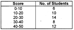
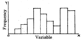
2. Frequency Diagram: Data in the form of grouped frequency distributions are generally represented by frequency diagrams like histogram, frequency polygon, frequency curve, and ogive
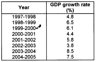
3. Arithmetic Line Graph: An arithmetic line graph is also called time-series graph and is a method of diagrammatic presentation of data. A line graph by joining these plotted points, thus, obtained is called arithmetic line graph or time-series graph.
Question 5. Explain Ogive? Answer: Cumulative frequency of any class is equal to the sum of the frequencies of all the classes preceding that class and its own frequency e.g., frequencies are 10, 7, 12, 17 and 22. Cumulative frequencies are 10, 10 + 7 = 17, 17 + 12 = 29, 29 + 17 = 46 and 46 + 22 = 68. Cumulative frequency of the last class = Total frequency.
For drawing an Ogive, cumulative frequency (i.e. number of values) is taken on the Y-axis and limits of class intervals on the X-axis. Ogive is of two types:
In a “less than” type Ogive, we plot the upper limit of each class along the X-axis and in a “more than” type Ogive, we plot the lower limit of each class along the X-axis. Along the Y-axis, we plot the cumulative frequencies at the end of each class. Ogive can be drawn even if the class interval are unequal or open end. Ogives are performed over frequency curves for comparative study.
Question 6. Illustrate how classes can be formed while presenting the data? Answer: Classes can be formed in two ways:
- Exclusive type
- Inclusive type
1. Exclusive Type: When the class intervals are so fixed that the upper limit of one class is the lower limit of the new class, it is known as exclusive method of classification.
In this method, higher value of the variable in the class is not included in that class i.e.,
2. Inclusive Type: In this method, the students getting say 39% marks will be included in class 30 – 39 itself i.e.,
Plus One Economics Presentation of Data Four Mark Questions and Answers
Question 1. Choose the correct answer a. Bar diagram is a
- one-dimensional diagram
- two-dimensional diagram
- diagram with no dimension
- none of the above
b. Data represented through a histogram can help in finding graphically the
- all the above
c. Ogives can be helpful in locating graphically the
d. Data represented through arithmetic line graph help in understanding
- long term trend
- cyclicity in data
- seasonality in data
Answer: a. 1. one-dimensional diagram b. 3. mode c. 3. median d. 1. long term trend
Question 2. Point out major parts of a statistical table. Answer:
- Table number
- Box head or caption
- Body or field
- Source note
Question 3. Give the rules for constructing tables. Answer: The rules of constructing diagrams are:
- Every diagram should be titled.
- It should suit the size of the paper
- It should be neat and attractive
- It should be neatly indexed
- It should contain footnotes
- The details in diagram should be self-explanatory
Plus One Economics Presentation of Data Five Mark Questions and Answers
Question 1. Explain the advantages of diagrammatic presentation. Answer: The advantages of diagrammatic presentation are given below.
- Diagram give a clear picture of data
- Comparison can be made easy
- Diagrams can be used university at any place
- It saves time and energy
- The data can be remembered easily
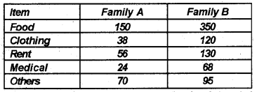
Question 2. Show how pie diagram is drawn for the following data?

Question 3. Give steps in the preparation of pie diagram. Answer: A pie diagram is also a component diagram, but unlike a component bar diagram, a circle whose area is proportionally divided among the components it represents. It is also called a pie chart. The circle is divided into as many parts as there are components by drawing straight lines from the centre to the circumference.
The following steps in the preparation of pie diagram are given below:
- Convert each component as percentage of the total.
- Multiply the percentage by 360/100 = 3.6 to convert into degree.
- Starting with the twelve o’clock position on the circle draw the largest component circle
- Draw other components in clockwise succession in descending order of magnitude except for each all components
Like all others and miscellaneous which are shown last:
- Use different columns or shades to distinguish between different components
- Explain briefly the different components either within the components in the figure or outside by arrow.
Plus One Economics Presentation of Data Eight Mark Questions and Answers
Question 1. Write short notes on the following
- pie diagrams
- frequency curves
- frequency polygon
- arithmetic line graph
Answer: 1. Pie Diagram: A pie diagram is also a component diagram, but unlike a component bar diagram, a circle whose area is proportionally divided among the components it represents. It is also called a pie chart. The circle is divided into as many parts as there are components by drawing straight lines from the centre to the circumference. Pie charts usually are not drawn with absolute values of a category.
The values of each category are first expressed as percentage of the total value of all the categories. A circle in a pie chart, irrespective of its value of radius, is thought of having 100 equal parts of 3.6° (3607100) each. To find out the angle, the component shall subtend at the centre of the circle, each percentage figure of every component is multiplied by 3.6°.
2. Frequency Polygon: A frequency polygon is a plane bounded by straight lines, usually four or more lines. Frequency polygon is an alternative to histogram and is also derived from histogram itself. A frequency polygon can be fitted to a histogram for studying the shape of the curve. The simplest method of drawing a frequency polygon is to join the midpoints of the topside of the consecutive rectangles of the histogram.
3. Frequency Curve: The frequency curve is obtained by drawing a smooth freehand curve passing through the points of the frequency polygon as closely as possible. It may not necessarily pass through all the points of the frequency polygon but it passes through them as closely as possible
4. Ogive: Ogive is also called cumulative frequency curve. As there are two types of cumulative frequencies, for example, less than type and more than type, accordingly there are two ogives for any grouped frequency distribution data. Here in place of simple frequencies as in the case of frequency polygon, cumulative frequencies are plotted along y-axis against class limits of the frequency distribution.
For less than give the cumulative frequencies are plotted against the respective upper limits of the class intervals whereas for more than ogives the cumulative frequencies are plotted against the respective lower limits of the class interval. An interesting feature of the two ogives together is that their intersection point gives the median
5. Arithmetic Line Graph: An arithmetic line graph is also called time-series graph and is a method of diagrammatic presentation of data. Init, time (hour, day/date, week, month, year, etc.) is plotted along x-axis and the value of the variable (time series data) along y-axis. A line graph by joining these plotted points, thus, obtained is called arithmetic line graph (time series graph). It helps in understanding the trend, periodicity, etc. in a long term time series data.
Question 2. 3 Forms of presentation of data
- Diagrams & graphs Prepare a flow chart.

Leave a Comment Cancel reply
Save my name, email, and website in this browser for the next time I comment.

IMAGES
VIDEO