- Content Writing Services
- Get in Touch

Case Study Format: 6 Layout Elements and How to Make Them Pop
Updated March 2024: Without a smart case study format and layout, no one will read your case study or engage with it. You need the expertise of a designer to grab and keep the reader’s attention.
In this post, we’ll explore 6 case study layout and format elements you need to include in your next case study. This post is part of a series on how to write a compelling case study .
Case study format does more than just pretty up a page
Once you’ve figured out the case study components you want to use, then it’s time to work with your designer to figure out a case study format and layout that will make your story pop.
Done well, strong case study layout and format elements will:
- highlight key case study metrics , facts or quotes
- increase readability by providing breaks for the eyes and mind
- use visuals to explain processes or impacts
- boost credibility and trustworthiness
- break complex topics into digestible morsels
Carefully applied color, headers, subheads, bolded text and bulleted lists should be part of every case study format.
6 case study format and layout elements to include
Here are 6 case study format elements to consider—you should include at least some of these:
1. Add testimonials (with headshots) to your case study layout
Using callouts, pull quotes or case study testimonials is the most popular graphic to include in a case study format, according to our 2024 survey of 115 customer marketers. Great callouts or pull quotes usually take the form of a customer testimonial. A great quote is a credible third-party review of what you do. Showcase it!
Select the best sound bites from your interview to use as callouts or pull quotes. They should be informative and substantial, but not more than a sentence or two. And don’t be afraid to splice together two fragments into one killer quote (but make sure you run the final version by the interviewee). Be sure to include attribution with all quotes.
Don’t forget to include a headshot with your testimonials. It will deliver instant trustworthiness and credibility. Unfortunately, testimonials are invented fairly regularly by less scrupulous companies, so adding your customer’s face, name, job title and company to the testimonial helps it carry more weight.
Also, readers relate to people. You’ve worked to humanize the customer experience by telling a relatable, candid story in your case study. Hammer it home with a quality headshot. Don’t accept a selfie or a photo from a wedding. Headshots must be on-brand, personable, professional and do both you and your customer justice.
Here’s a sample of a headshot from our own website:
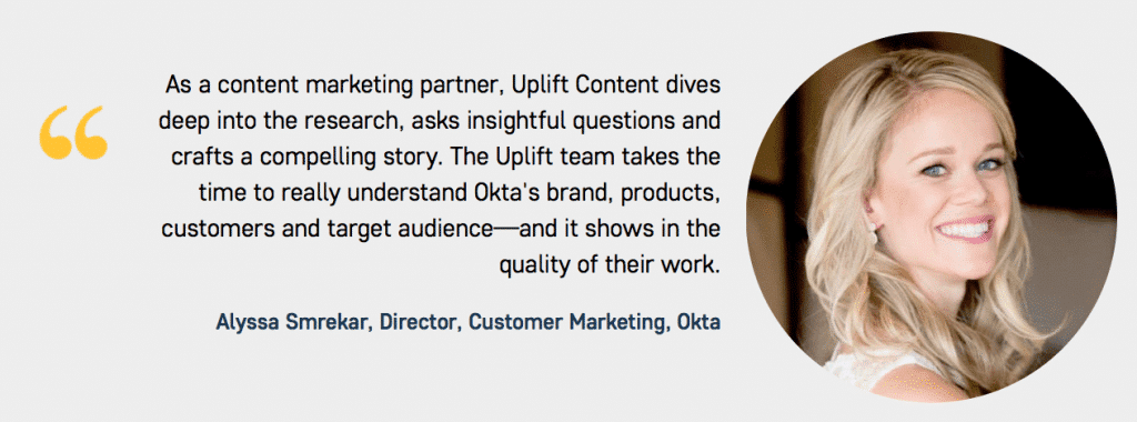
And here’s another sample from HR software company Zenefits’ case study on its customer, Skilljar:

2. Include strong metrics in your case study format
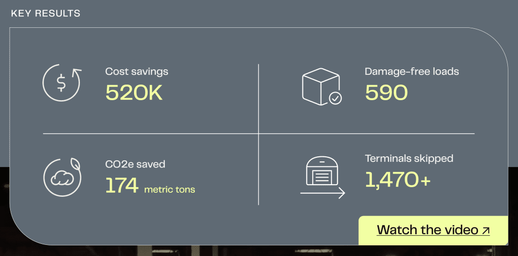
Metrics are the third most popular graphic to include in your case studies, but we also know that identifying impactful metrics for case studies is a big challenge.
So, if you ARE able to get some compelling metrics, be sure to showcase them near the top of your case study layout.
Here’s a simple but effective example of a metrics block from Databricks :

And here’s a cool metrics block from Flock Freight :
3. Use workplace photos in your case study format and layout elements
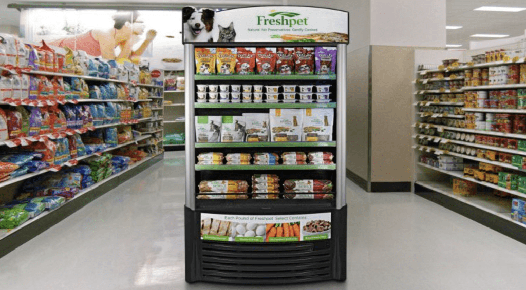
If possible or relevant, include other photos from the customer’s workplace. This can help the reader understand the type of industry, work processes and standards of the customer. Vast libraries of stock photos are available if you’re stuck—but your own pictures will be better and tell the story more honestly.
This workplace photo from an Expensify case study on Philz Coffee helps readers quickly understand some of the context of the story.

This product shot from a ServiceChannel case study on FreshPet also helps readers visually connect with the story.

4. Include data illustrations to enhance your case study format
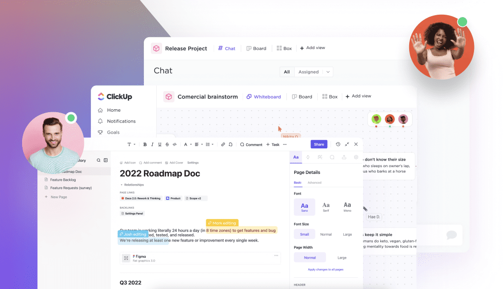
Some readers are visual. The best case study format samples include clear data illustrations with minimal text, which are more effective than a paragraph full of numbers. Experiment with the best way to showcase the statistics or data you have. Examples include:
ClickUp uses screenshots and graphics to help readers understand what the solution looks like:
Imprivata (formerly Fairwarning) uses helpful graphics like this to clarify relational information in a visual way:

5. Add informative infographics to your case study layout and format elements
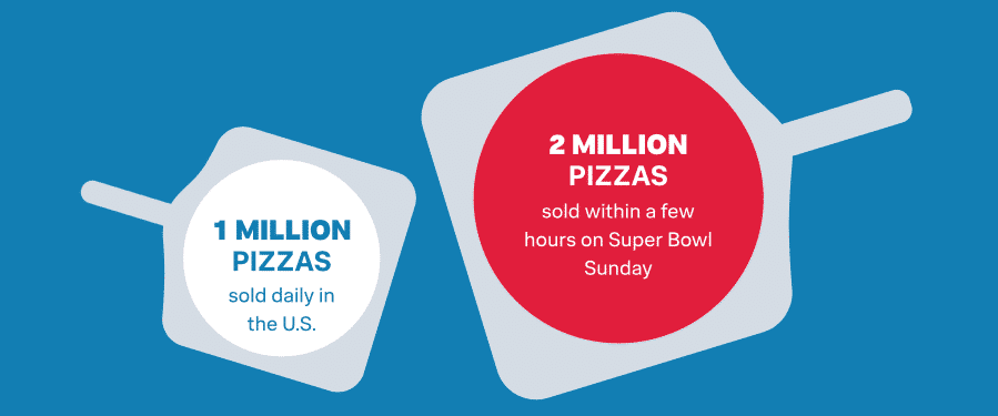
Infographics visually break down a complex process into simple steps, or help guide the reader through the highlights of your case study.
Some elements of a case study format may lend themselves to infographics more than others. If you think this may be the case, talk to an experienced designer. Translating words into a compelling graphic is an art.
Infographics are currently underused —only 19% of respondents include them as a case study layout—but another 39% plan to try infographics this year .
Here are two great samples of infographics from Splunk’s case study on Domino’s Pizza:
6. Finish your case study format with a compelling call to action
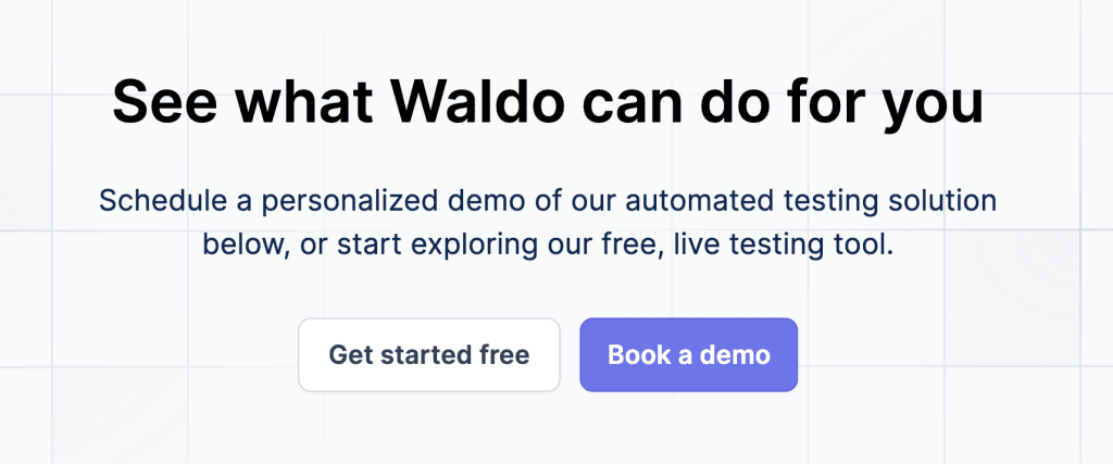
If you’ve held your reader’s attention until the end of your case study, they’re likely interested in learning more about your products and services. Consider including a “Read more stories” or “Watch a demo” call to action (CTA) at the bottom of your case study format. Make sure your case study CTA stands out from the text in your case study layout by using large fonts, colors and graphic elements like boxes or lines.
Here’s an example from Flock Freight that illustrates how this CTA element could look:

Here’s another example of a CTA from Waldo , which offers readers two avenues to explore next:
Case study layout is important, but keep the focus on the story
Remember, although the visual elements of a case study format should be strong, the text is still the main feature of your case study. You should use case study layout and design elements to pull the reader through the story, highlight key points and make for an easier reading experience. Don’t let the case study format and layout elements overwhelm the reader.
You’re swamped. We’re here to help.
Check out our B2B SaaS case study writing services . We work with high-growth companies like Okta and WalkMe to create powerful case studies that nurture leads and close sales faster.

As the founder of Uplift Content, Emily leads her team in creating done-for-you case studies, ebooks and blog posts for high-growth SaaS companies like ClickUp, Calendly and WalkMe. Connect with Emily on Linkedin
Sign up for the Content Huddle newsletter
Learn from Emily’s 17 years of aha moments, mistakes, observations, and insights—and find out how you can apply these lessons to your own marketing efforts.
You can unsubscribe any time. Visit our Terms of Use for information on our privacy practices.

IMAGES
VIDEO
COMMENTS
Case study template with multiple components, visual styles and frame sizes. Learn more
Explore what a case study is, how to prepare for writing one, what to include in it, and how it can be an effective tactic.
All good case study designs will include a combination of photo, video, and illustrations or charts to tell a story of their clients’ success. Rather than just relying on text, these visual aids back-up any claims being made as …
Businesses need to perform some research to become successful and gain new customers. Here are the case study templates that you can download for free.
Customize your favorite case study layout with your own brand colors, fonts and logo, add or remove pages, and download in high-quality to use as a lead magnet or upload on your website. You can also embed the case study for free.